
Xspeeria
Fintech
FX Marketplace
Mobile App
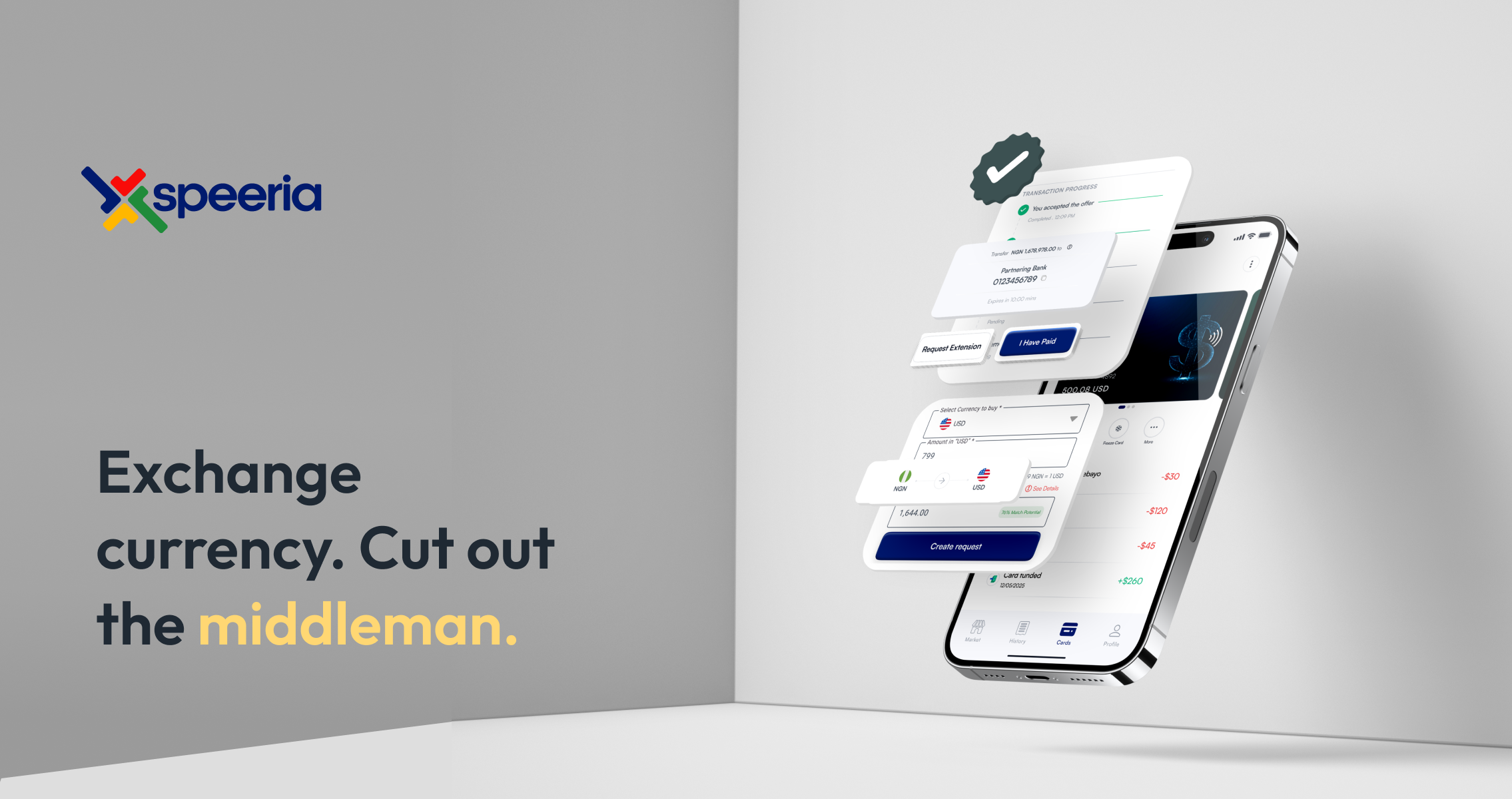
Xspeeria is a peer-to-peer foreign exchange marketplace that lets people exchange currencies directly — with AI-assisted rate guidance, anonymous matching, physical debit cards funded at the point of exchange, and full transaction transparency.
01 — Context
The $190 billion problem with FX.
Currency exchange today is expensive, opaque, and slow. Whether you're a Nigerian student sending money to the UK, a tourist in Dubai exchanging USD for AED, or an African merchant selling to European buyers, the system takes 3–7% per transaction and tells you almost nothing about where your money is at any point. Xspeeria was founded to dismantle this model. A startup approached me to design the entire mobile product from the ground up, from the first onboarding screen to the debit card management module.
02 — Research & Discovery
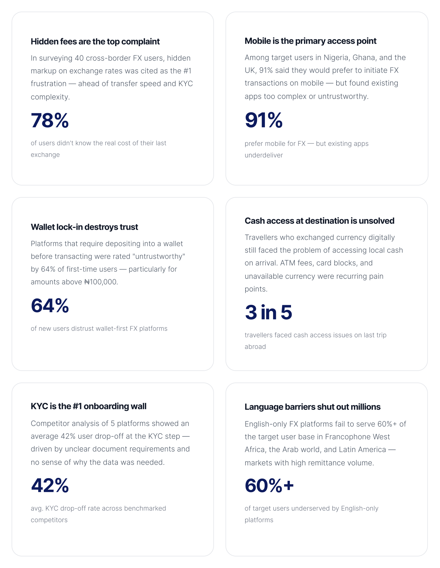
What the data said about FX users
Before any wireframes, I ran a research sprint to understand who was using P2P FX platforms, why they were switching away from banks, and where existing products were failing them. Here's what came back.
03 — User Personas
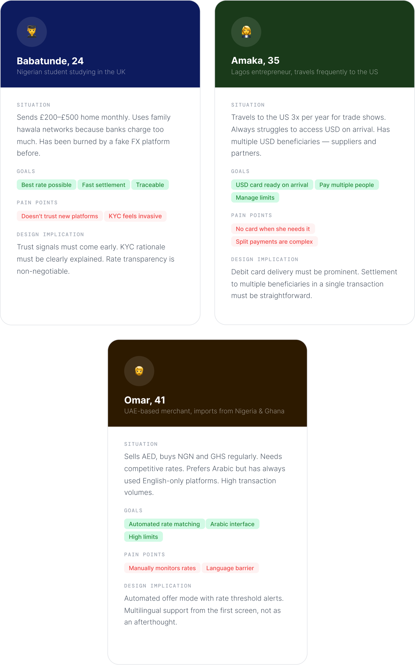
Three people, One product.
Research surfaced three distinct user archetypes, each with different motivations, anxieties, and success criteria. Designing for all three without building three different apps was a core challenge.
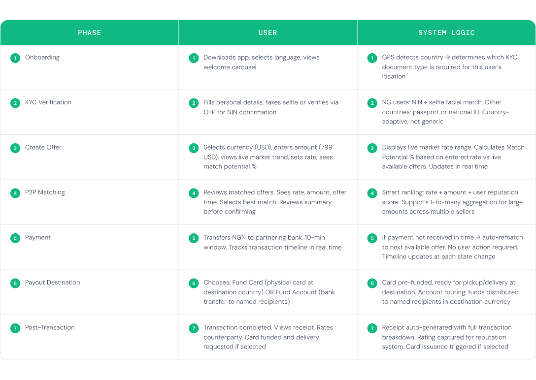
04 — User Flow
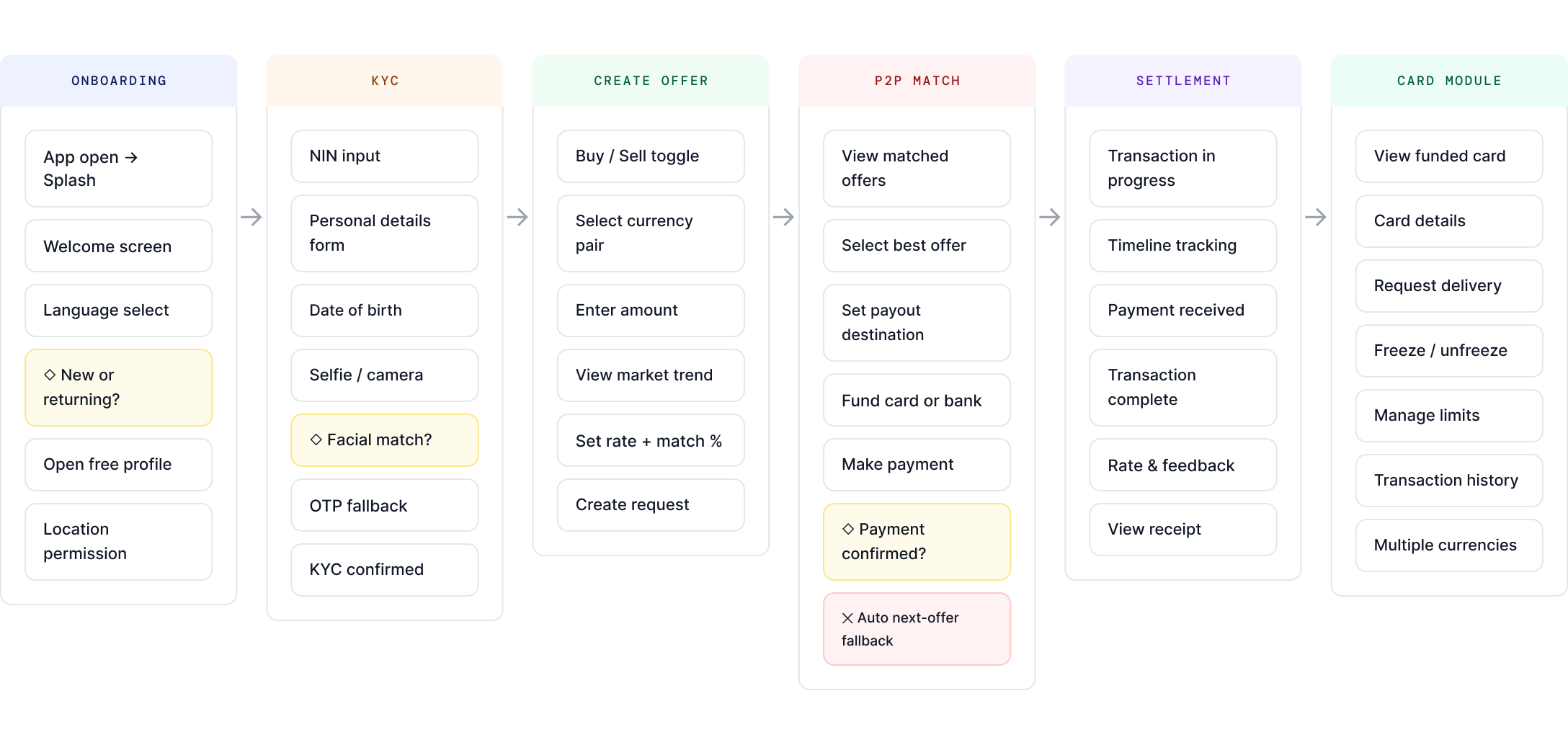
Every path through the product
Before moving to wireframes, I mapped the complete end-to-end user flow, from first open to completed transaction with card delivery. This surfaced 4 critical decision points that shaped the IA of the entire app.
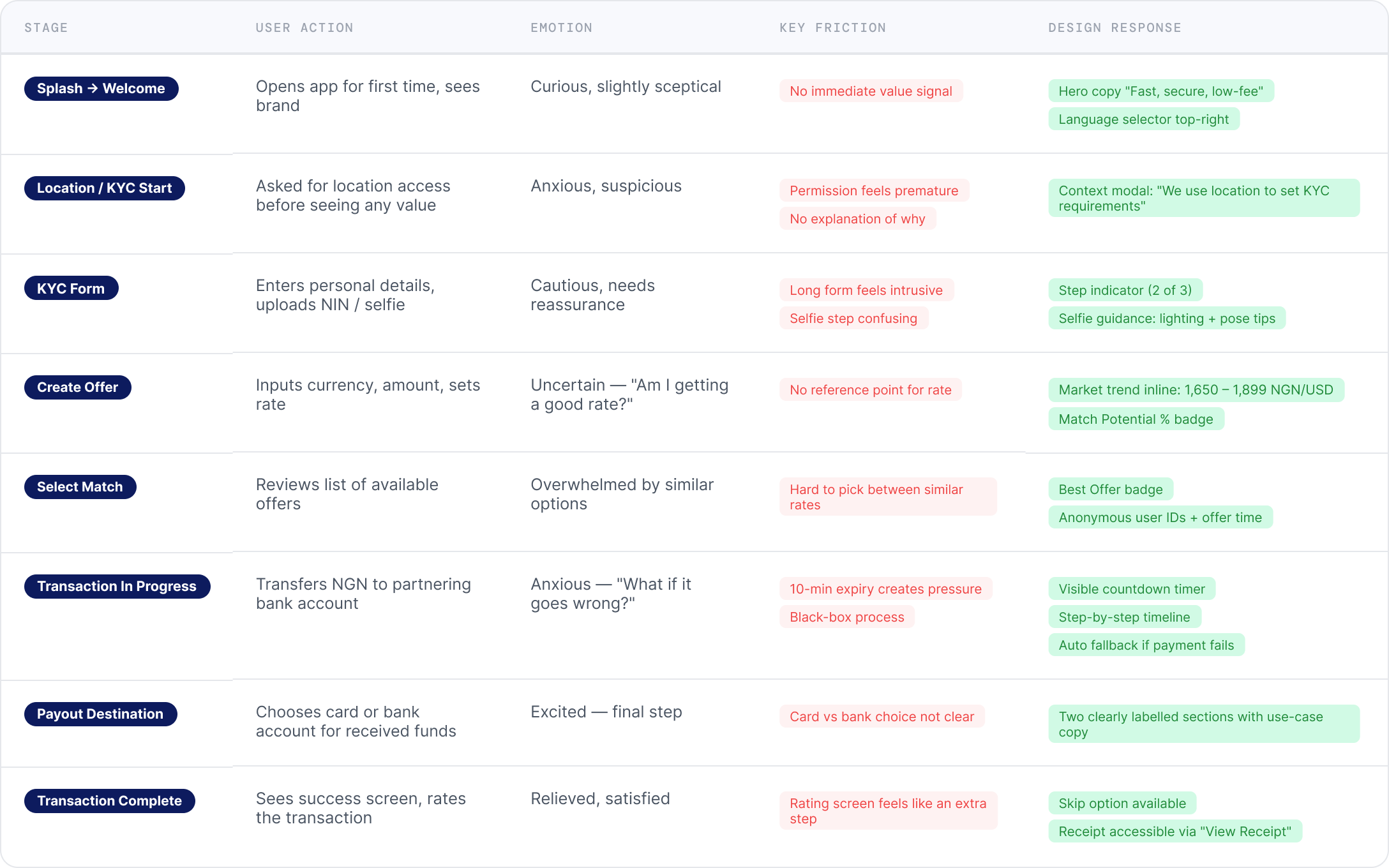
05 — Journey Map
Where users feel friction
Mapping the emotional journey against each phase of the flow pinpointed exactly where design effort needed to be concentrated and why.
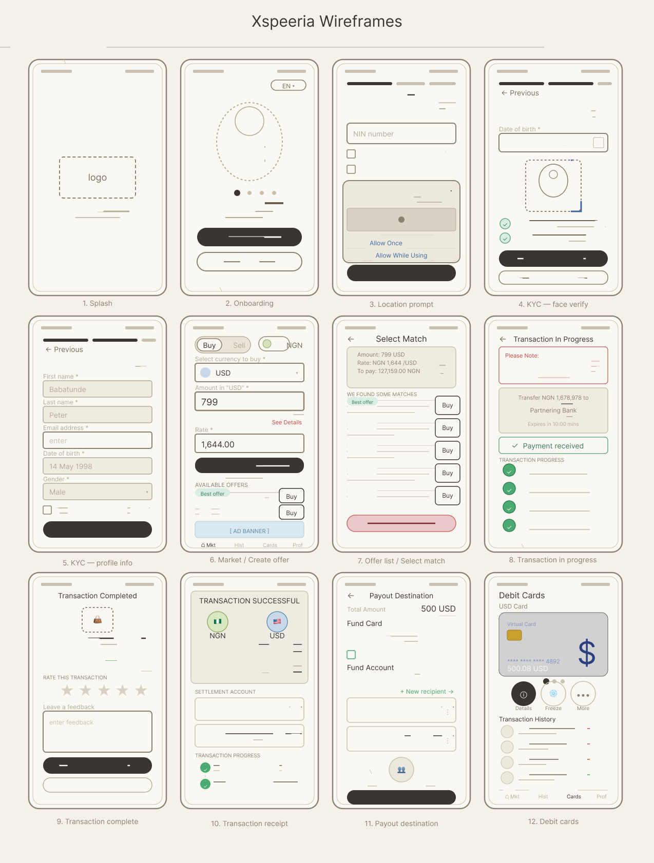
06 — Wireframes
Low friction entry. Build trust early.
Low-fidelity wireframes established the information architecture and interaction logic of each key screen before any visual design decisions were made. The goal: validate the flow with the client before investing in high-fidelity work.
08 — Hi-Fi Screens
Design decisions
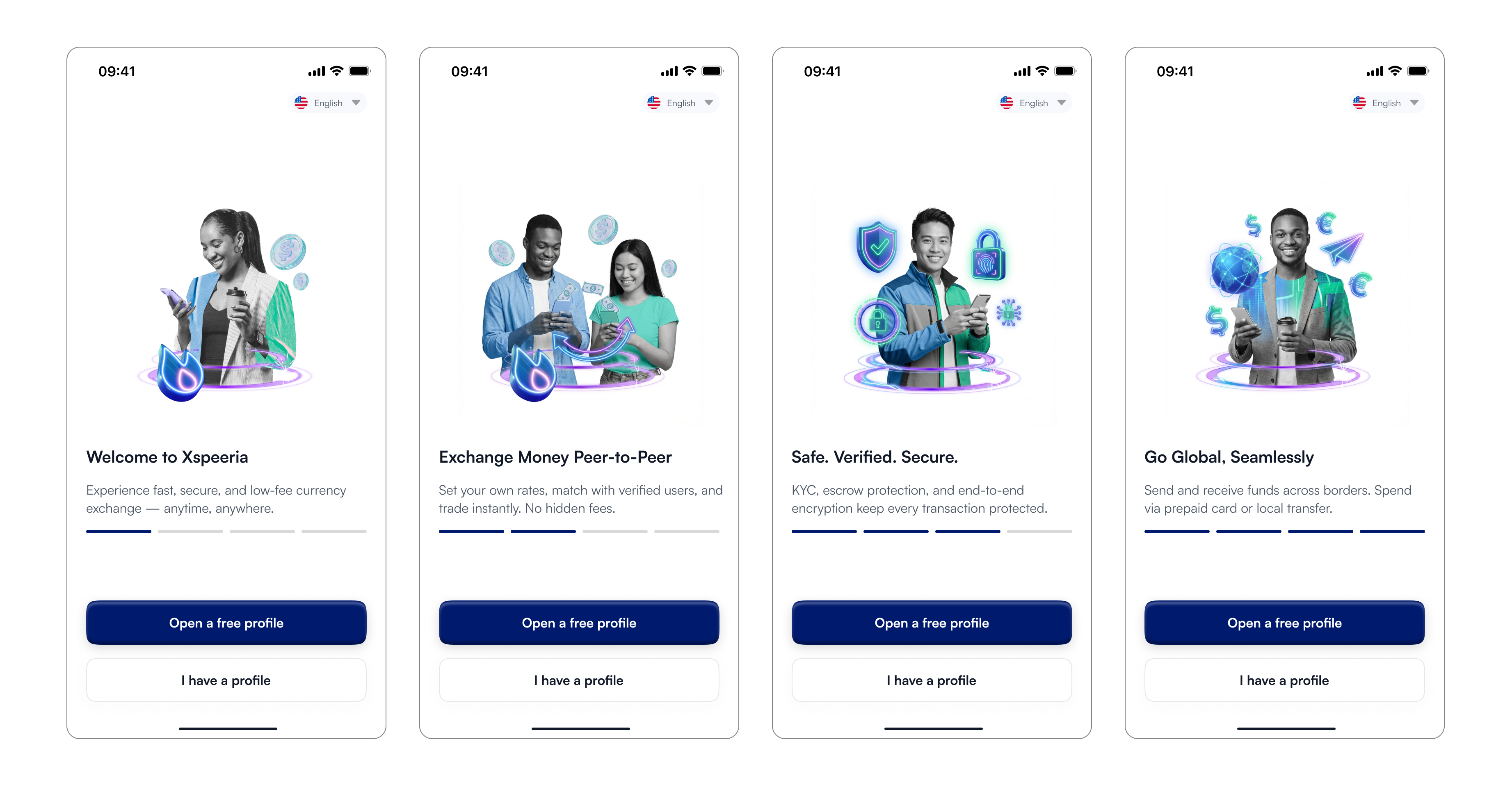
Onboarding
First impression. Maximum trust.
The onboarding screen does three jobs simultaneously: establish brand
credibility, communicate the core value proposition, and give the user a
frictionless path to getting started. The language selector in the top-right is visible from the very first screen — a signal to non-English users that this platform was built for them too.
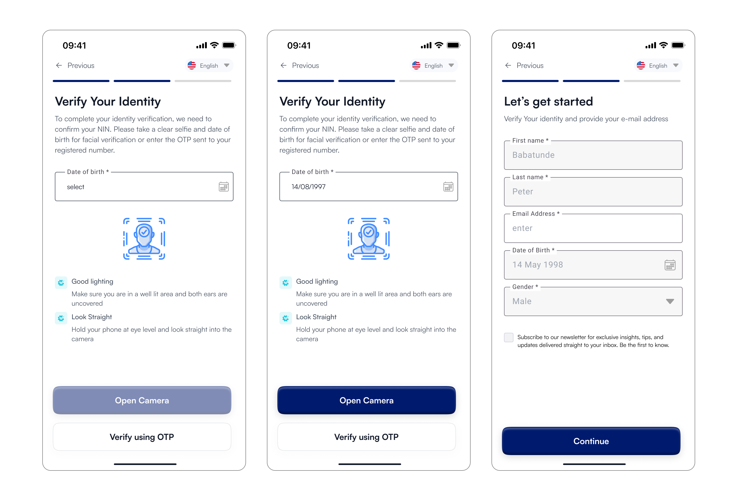
KYC — Two-Step Verification
Smart KYC: your location determines your document.
Rather than asking every user for every possible document, Xspeeria uses GPS to determine which KYC requirement applies. Nigerian users verify via NIN + selfie. This was a compliance win and a UX win simultaneously.
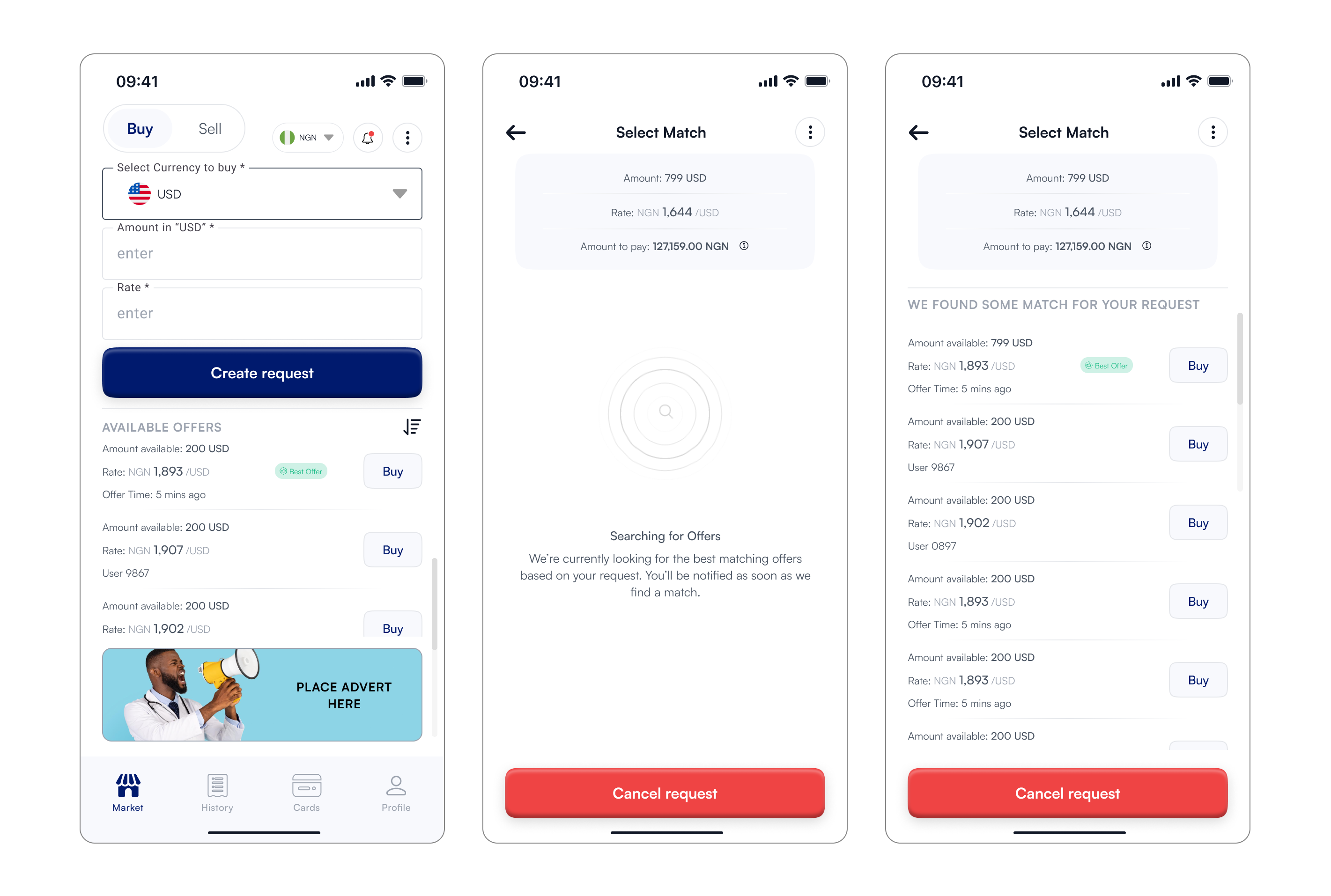
Offer creation
From Informed decisions, to getting the best match
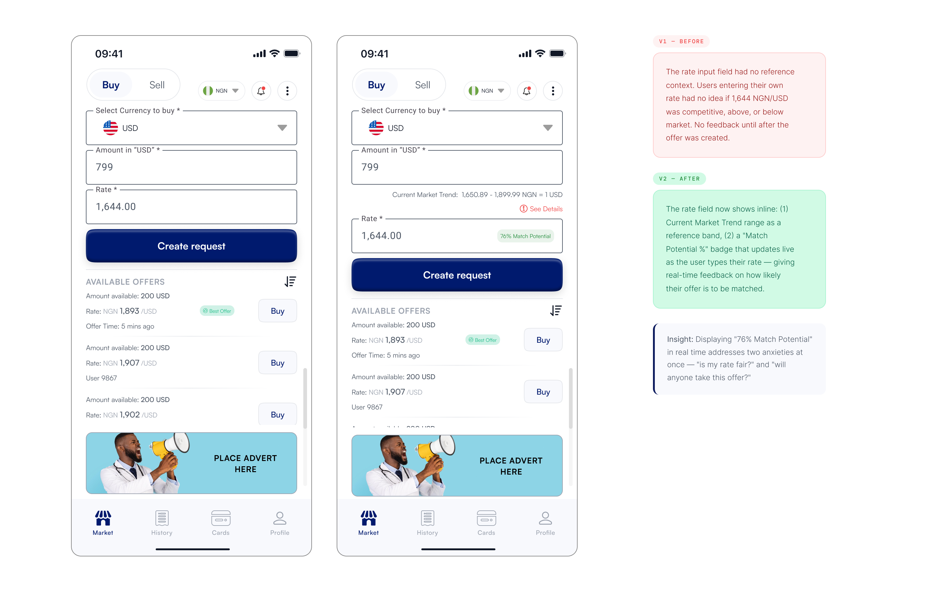
The create offer screen carried the highest UX complexity in the product. It needed to help users set a competitive rate without overwhelming them. The solution was embedding live market intelligence directly inside the form fields.
After creating a request, the system surfaces available matches. The challenge: multiple offers with similar rates can overwhelm users. The design solution: smart defaults, clear badging, and anonymous-but-trustworthy user identifiers.
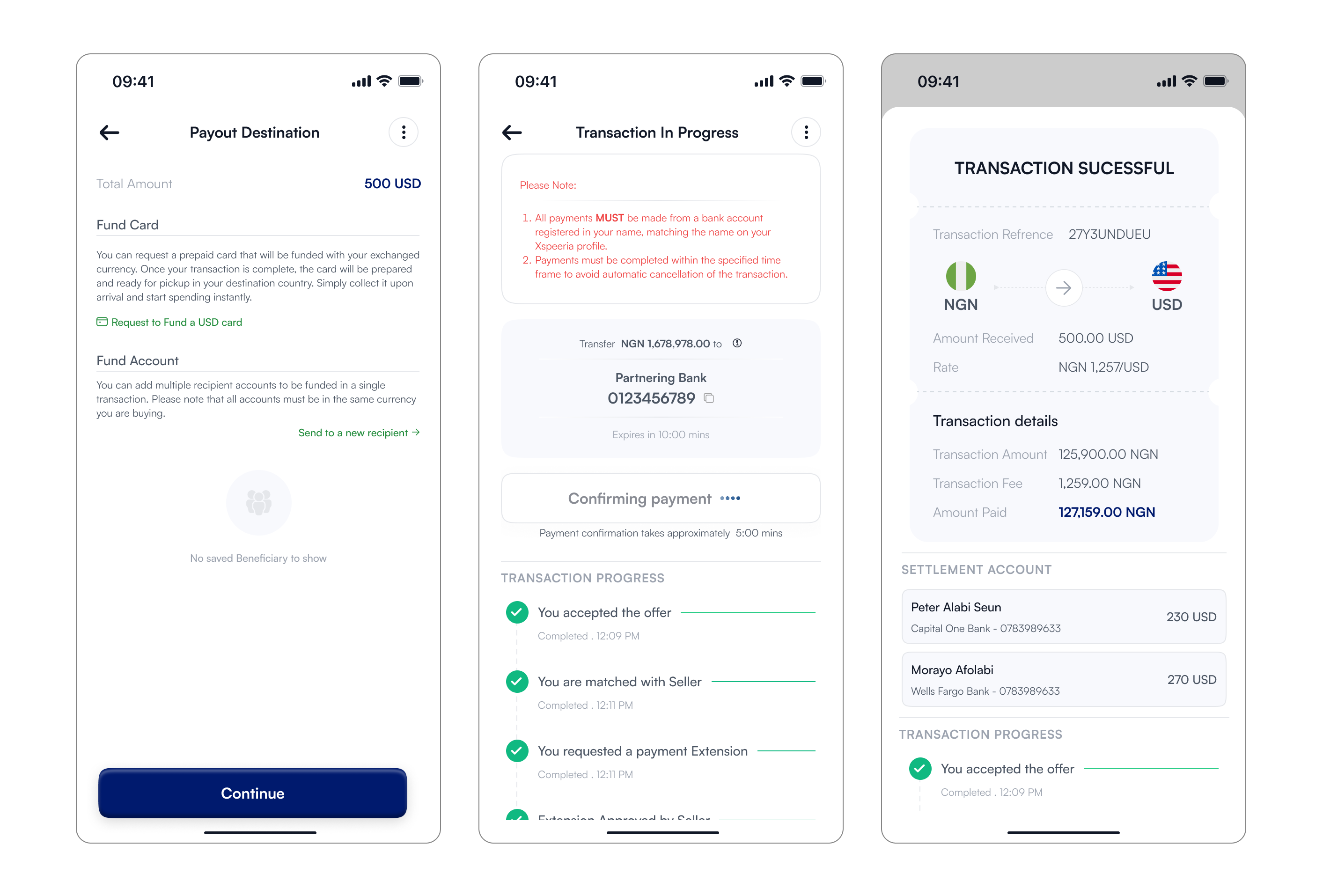
Transaction
Full visibility and control. Zero black boxes.
Xspeeria's payout destination screen is the product's most distinctive moment, where digital P2P exchange meets real-world spending power, letting users choose between a funded debit card at their destination or a direct bank transfer to named recipients. The transaction-in-progress screen carries the heaviest emotional weight in the flow, with every element answering one anxious question: what is happening to my money right now? That tension resolves on the completion screen, which simultaneously confirms success, generates a permanent receipt, and captures a counterparty rating, quietly building the reputation infrastructure that makes P2P trustworthy at scale.
09 — Iterations
What changed between V1 and final.
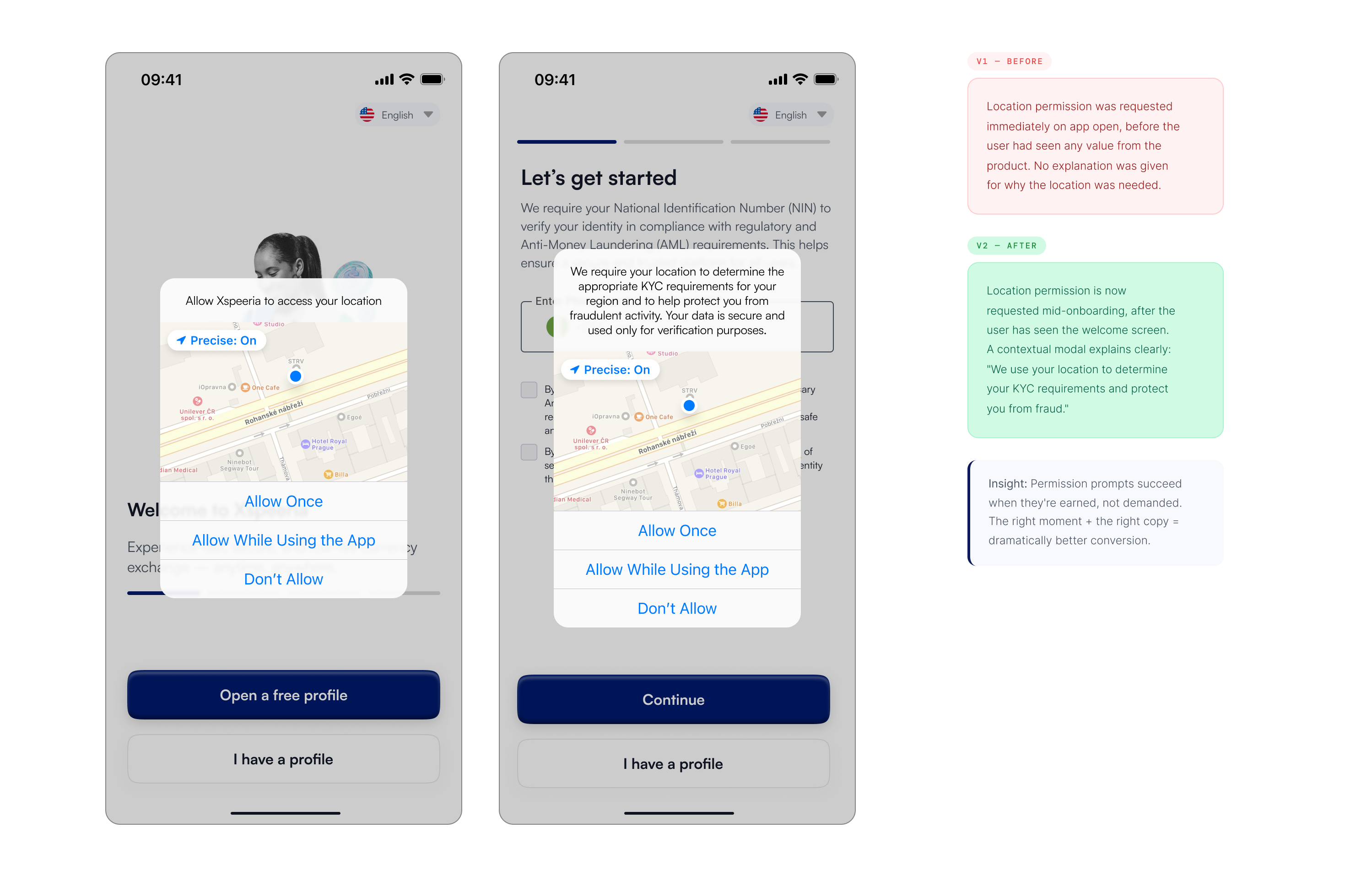
- In testing, 6 of 8 users tapped "Don't Allow" when the permission prompt appeared on the splash screen with no explanation. Moving it mid-flow with a rationale modal reduced this to 1 of 8. The copy was critical: users needed to understand the benefit to themselves, not just the system requirement.
- This was the most critical iteration in the product. Users creating offers without rate context were either setting rates too low (losing money) or too high (not getting matched). The Market Trend band and Match Potential badge were added after stakeholder feedback and transformed the offer creation experience from guesswork to informed decision-making.
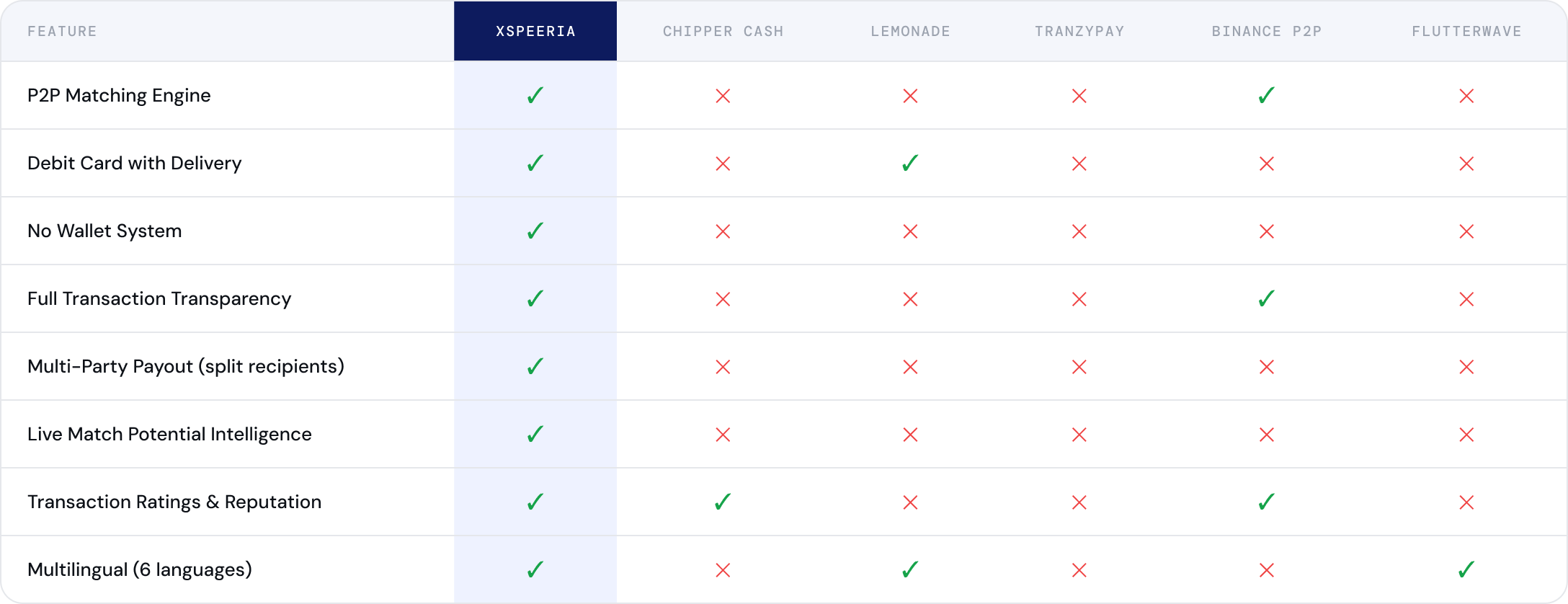
10 — Competitive Positioning
The gap no one else fills
The competitive audit mapped Xspeeria against five incumbents across 8 feature dimensions. The result confirms a defensible, uncrowded position — particularly the combination of P2P matching, debit card delivery, no-wallet architecture, and AI rate forecasting.
12 — Reflections
What this taught me.
- Fintech trust is earned in microcopy
- A missing feature can be the biggest feature
- Information architecture is product strategy

Onome Eluyera
Userbility Tester

The market screen does something smart by showing live match potential (the "76% Match" badge) alongside the rate field.
Other Projects
© 2026 — Product Designer — Lagos, Nigeria
design@tijesuniolajide.com
Xspeeria
Fintech
FX Marketplace
Mobile App
Xspeeria is a peer-to-peer foreign exchange marketplace that lets people exchange currencies directly — with AI-assisted rate guidance, anonymous matching, physical debit cards funded at the point of exchange, and full transaction transparency.
01 — Context
The $190 billion problem with FX.
Currency exchange today is expensive, opaque, and slow. Whether you're a Nigerian student sending money to the UK, a tourist in Dubai exchanging USD for AED, or an African merchant selling to European buyers, the system takes 3–7% per transaction and tells you almost nothing about where your money is at any point. Xspeeria was founded to dismantle this model. A startup approached me to design the entire mobile product from the ground up, from the first onboarding screen to the debit card management module.
02 — Research & Discovery
What the data said about FX users
Before any wireframes, I ran a research sprint to understand who was using P2P FX platforms, why they were switching away from banks, and where existing products were failing them. Here's what came back.
03 — User Personas
Three people, One product.
Research surfaced three distinct user archetypes, each with different motivations, anxieties, and success criteria. Designing for all three without building three different apps was a core challenge.
04 — User Flow
Every path through the product
Before moving to wireframes, I mapped the complete end-to-end user flow, from first open to completed transaction with card delivery. This surfaced 4 critical decision points that shaped the IA of the entire app.
05 — Journey Map
Where users feel friction
Mapping the emotional journey against each phase of the flow pinpointed exactly where design effort needed to be concentrated and why.
06 — Wireframes
Low friction entry. Build trust early.
Low-fidelity wireframes established the information architecture and interaction logic of each key screen before any visual design decisions were made. The goal: validate the flow with the client before investing in high-fidelity work.
08 — Hi-Fi Screens
Design decisions
Onboarding
First impression. Maximum trust.
The onboarding screen does three jobs simultaneously: establish brand
credibility, communicate the core value proposition, and give the user a
frictionless path to getting started. The language selector in the top-right is visible from the very first screen — a signal to non-English users that this platform was built for them too.
KYC — Two-Step Verification
Smart KYC: your location determines your document.
Rather than asking every user for every possible document, Xspeeria uses GPS to determine which KYC requirement applies. Nigerian users verify via NIN + selfie. This was a compliance win and a UX win simultaneously.
Offer creation
From Informed decisions, to getting the best match
The create offer screen carried the highest UX complexity in the product. It needed to help users set a competitive rate without overwhelming them. The solution was embedding live market intelligence directly inside the form fields.
After creating a request, the system surfaces available matches. The challenge: multiple offers with similar rates can overwhelm users. The design solution: smart defaults, clear badging, and anonymous-but-trustworthy user identifiers.
Transaction
Full visibility and control. Zero black boxes.
Xspeeria's payout destination screen is the product's most distinctive moment, where digital P2P exchange meets real-world spending power, letting users choose between a funded debit card at their destination or a direct bank transfer to named recipients. The transaction-in-progress screen carries the heaviest emotional weight in the flow, with every element answering one anxious question: what is happening to my money right now? That tension resolves on the completion screen, which simultaneously confirms success, generates a permanent receipt, and captures a counterparty rating, quietly building the reputation infrastructure that makes P2P trustworthy at scale.
09 — Iterations
What changed between V1 and final.
- In testing, 6 of 8 users tapped "Don't Allow" when the permission prompt appeared on the splash screen with no explanation. Moving it mid-flow with a rationale modal reduced this to 1 of 8. The copy was critical: users needed to understand the benefit to themselves, not just the system requirement.
- This was the most critical iteration in the product. Users creating offers without rate context were either setting rates too low (losing money) or too high (not getting matched). The Market Trend band and Match Potential badge were added after stakeholder feedback and transformed the offer creation experience from guesswork to informed decision-making.
10 — Competitive Positioning
The gap no one else fills
The competitive audit mapped Xspeeria against five incumbents across 8 feature dimensions. The result confirms a defensible, uncrowded position — particularly the combination of P2P matching, debit card delivery, no-wallet architecture, and AI rate forecasting.
12 — Reflections
What this taught me.
- Fintech trust is earned in microcopy
- A missing feature can be the biggest feature
- Information architecture is product strategy
Onome Eluyera
Userbility Tester
The market screen does something smart by showing live match potential (the "76% Match" badge) alongside the rate field.
Other Projects
Xspeeria
Jalode
HumanManager Mobile Application
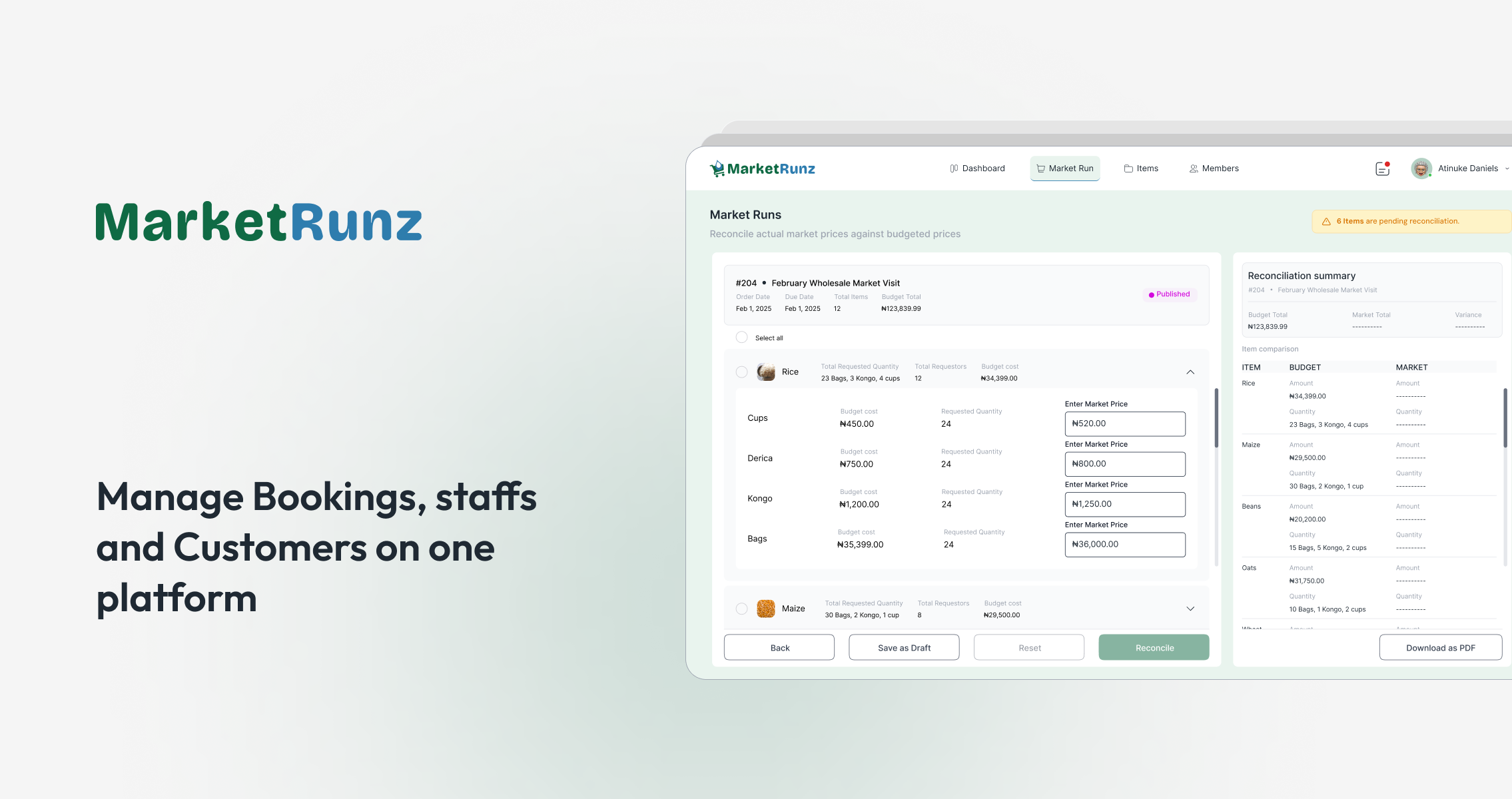
MarketRunz
© 2026 — Product Designer — Lagos, Nigeria
design@tijesuniolajide.com