
Jalode
Web
B2B
Saas/ Marketplace
Redesigning the merchant onboarding experience for a multi-sided SaaS platform serving hotels, gyms, spas, and salons across Nigeria.
01 — Context
What is Jalode?
Jalode is a multi-sided SaaS platform and marketplace designed to be the operating system for service businesses — hotels, gyms, spas, and salons. It combines merchant management tools (bookings, staff, CRM, POS, payments) with a customer-facing marketplace for discovery and booking. For Jalode to work, merchants must be onboarded successfully. A failed or abandoned onboarding means no revenue, no customers, and no value generated on either side of the
marketplace.

02 — Problem
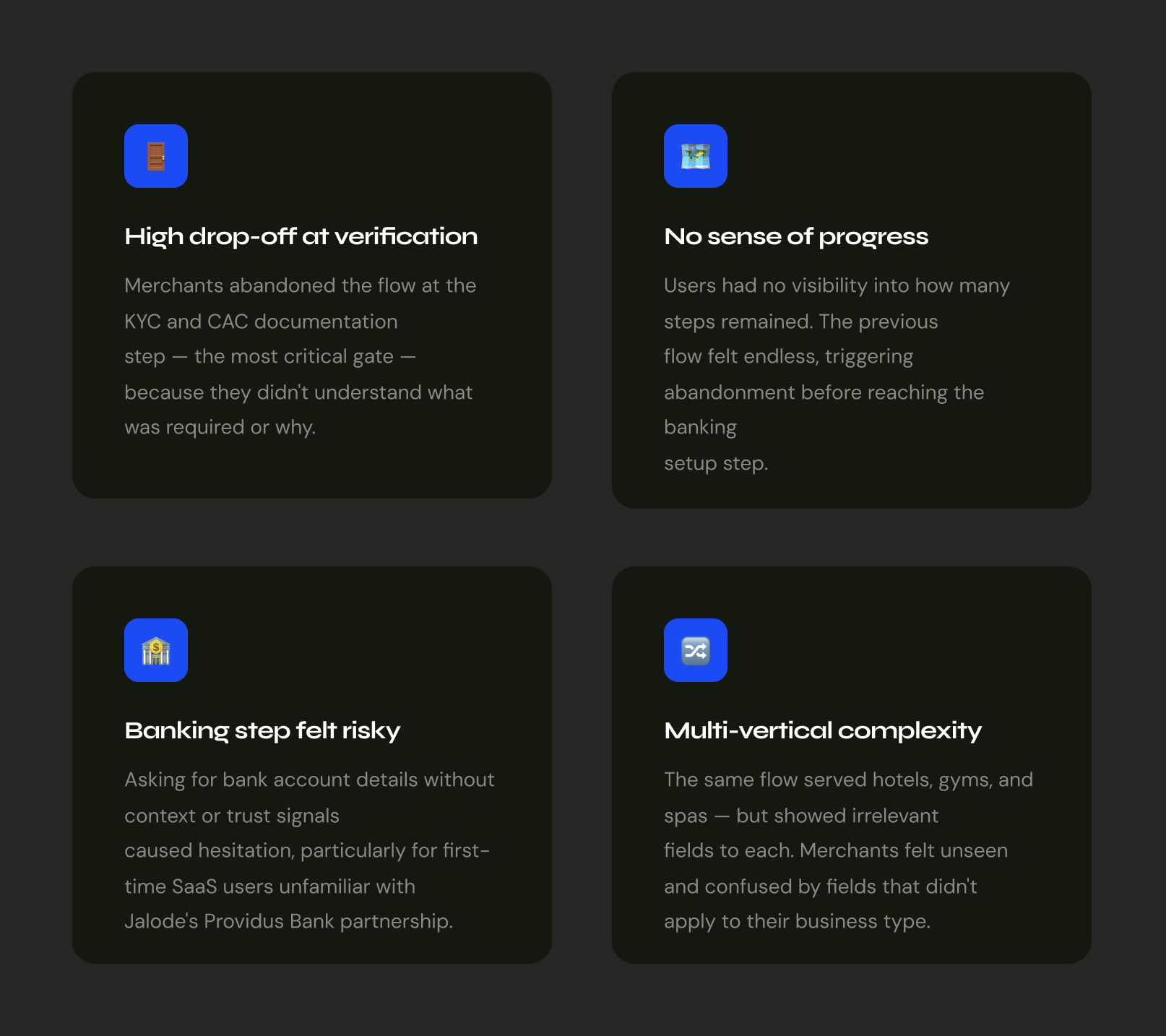
Onboarding was a wall, not a door.
The merchant onboarding process was technically functional but poorly designed for the reality of Nigerian business owners — many of whom were registering a digital SaaS platform for the first time. The flow was long, opaque, and offered no sense of progress or trust.
03 — Research & Discovery
Mapping the merchant's journey
Before touching any screens, I mapped the full journey from a prospective merchant's first contact point through to their first live booking — identifying friction, anxiety, and moments of delight.
04 — Information Architecture
Wireframes & flow logic.
Low-fidelity wireframes mapped the structural logic of each step before any visual design began. The primary goal: make each step feel singular and completable.
05 — High Fidelity Screens
Design decisions, annotated.
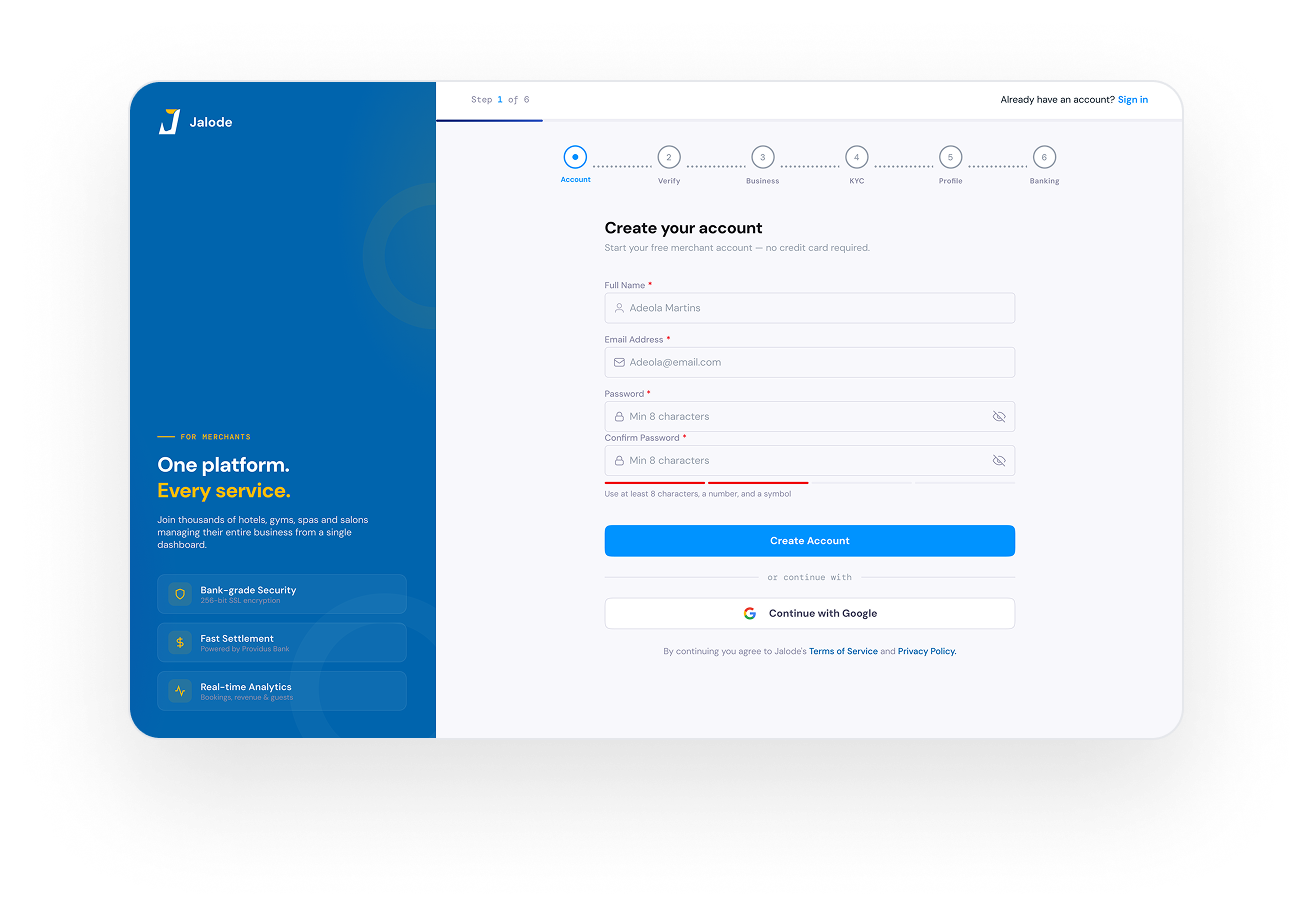
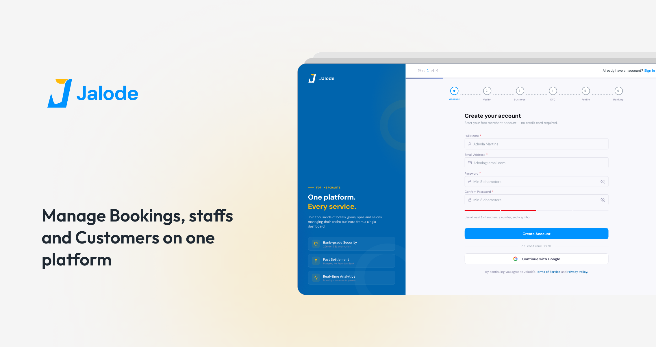
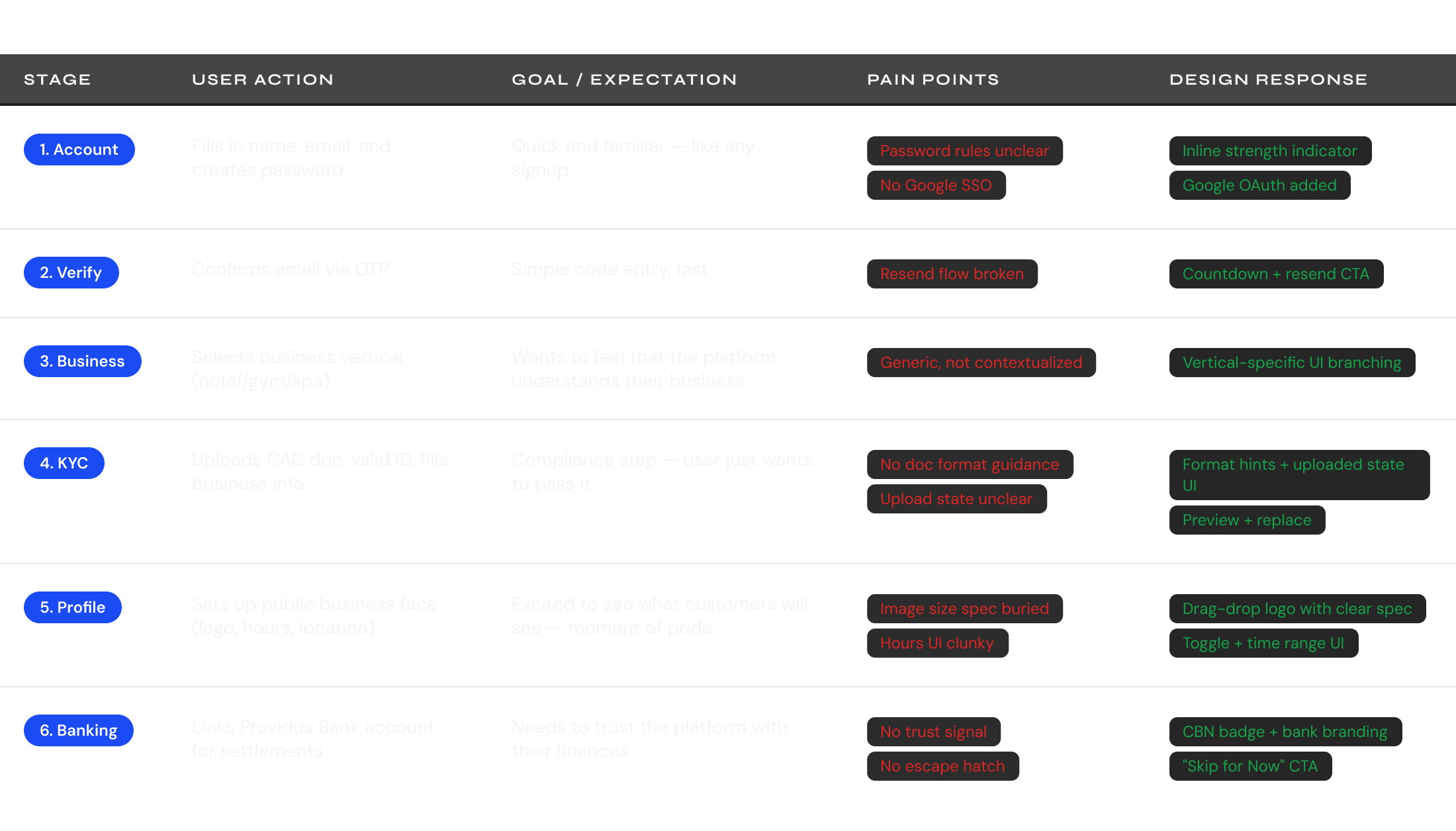
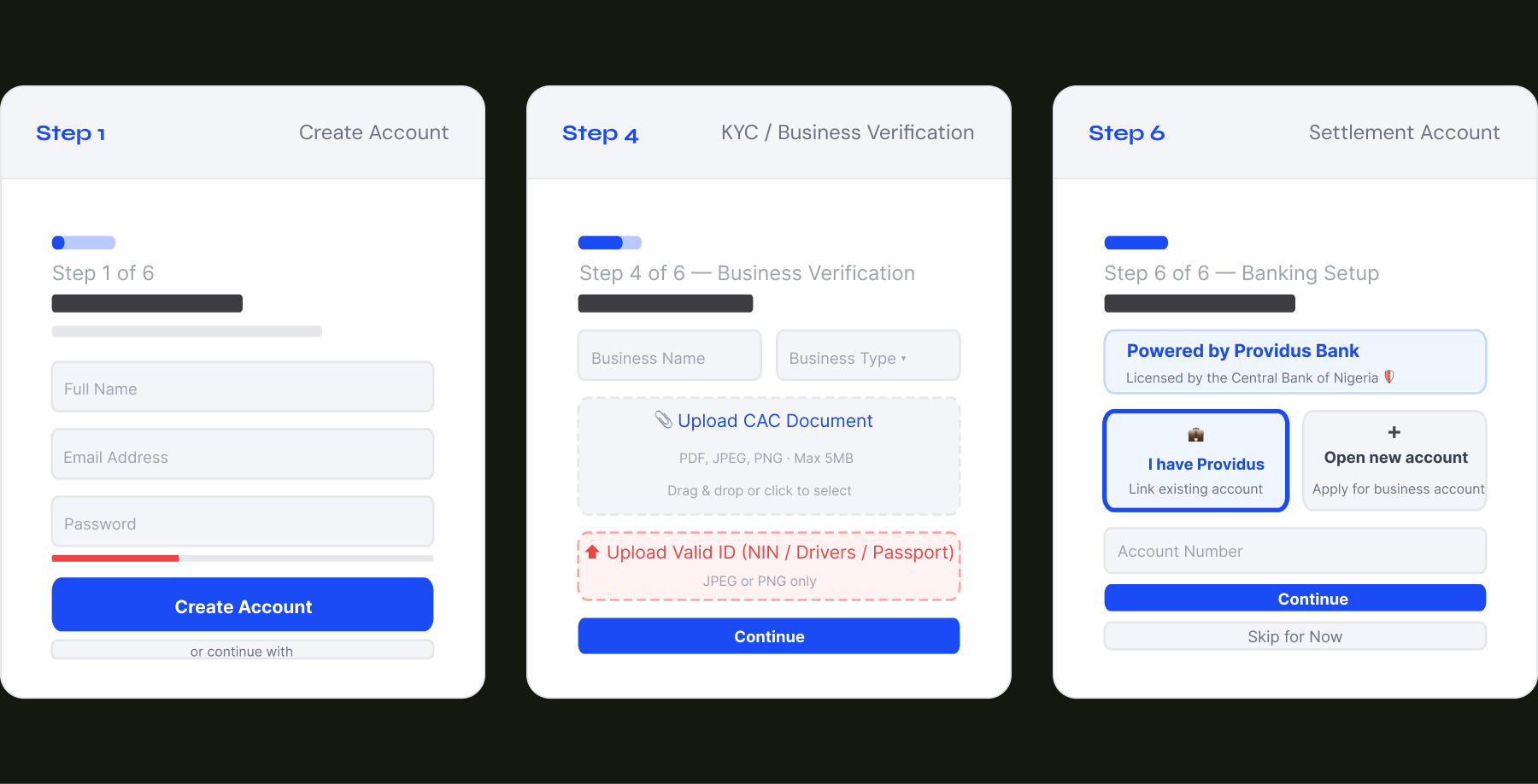
Step 1 of 6 — Account Creation
Low friction entry. Build trust early.
The lefthand panel runs across all 6 steps — not just for brand presence, but to communicate Jalode's value proposition while the user fills in forms. It turns a dead column into a conversion asset.
- Persistent left panel highlights Bank-grade Security, Fast Settlement, and Real-time Analytics — addressing the 3 biggest merchant anxieties upfront
- Password strength indicator with inline copy ("Min 8 chars, a number, and a symbol") reduces form errors without a separate validation screen.
- Google OAuth reduces time-to-step-2 for users with Gmail accounts — the dominant email provider among Lagos business owners.
- Progress stepper at the top is always visible — sets expectation of 6 steps, preventing mid-flow abandonment from surprise.
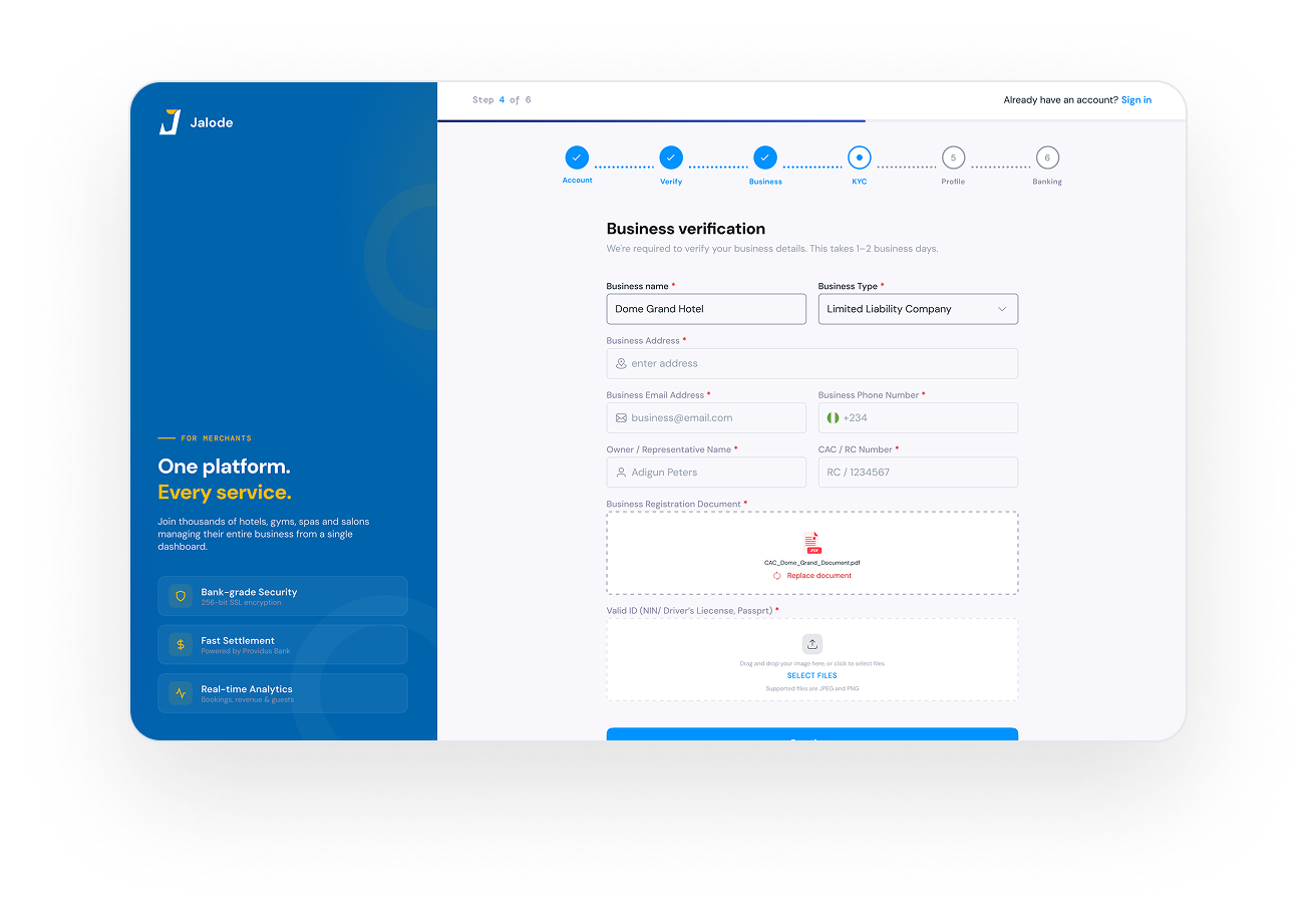
Step 4 of 6 — KYC / Business Verification
The hardest step, made approachable.
This was the #1 drop-off point in the old flow. The redesign treats it as a compliance task, not a test — guiding users through what's needed and why, with clear upload states.
- Uploaded CAC doc shows filename + "Replace document" link gives users control and eliminates anxiety about uploading the wrong file.
- Upload zones use dashed borders and inline guidance standard affordance or document upload, reducing cognitive load.
- CAC/RC Number field placeholder shows format (RC / 1234567)— removing a common source of confusion for new registrations.
- Subtitle copy: "We're required to verify your business. This takes 1–2 business days." — sets expectations, prevents repeated check-ins.
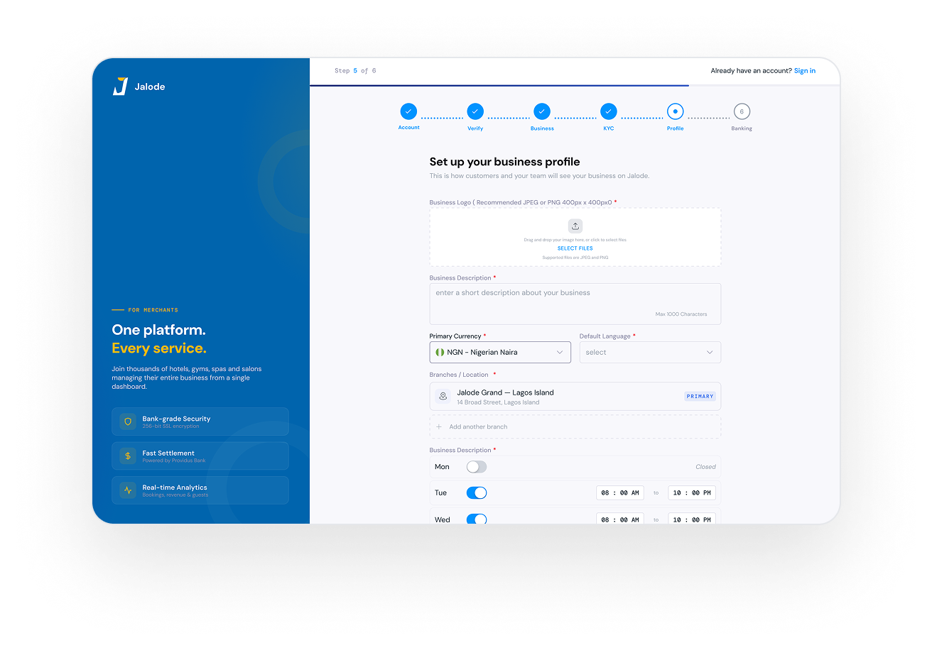
Step 5 of 6 — Business Profile Setup
The moment of pride. Make it feel real.
Merchants setting up their public profile are crossing from compliance into identity. This step needed to feel exciting — like launching a storefront, not filling a form.
- Logo upload zone is prominent and centered — the first visual act of brand ownership for the merchant on Jalode.
- Branch/Location component with "Add another branch" expands the form inline — avoids a new page for multi-location businesses.
- Operating hours uses toggle + time range pattern — toggling a day to "Closed" hides the time range, reducing visual clutter.
- Primary Location badge is immediately visible — important for multi-branch merchants who need to understand which location is default.
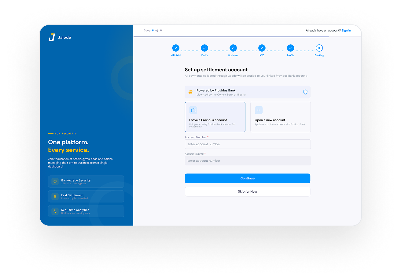
Step 6 of 6 — Settlement Account
Trust architecture for money conversations.
Asking a business owner to enter their bank account details in a new platform is a high-stakes UX moment. Every element on this screen exists to reduce anxiety and communicate legitimacy.
- "Powered by Providus Bank — Licensed by the Central Bank of Nigeria" appears above the form inputs. CBN licensing is a potent trust signal for Nigerian SMEs.
- Two-option card pattern (existing account vs. open new) sets context before asking for numbers — user understands what they're linking.
- "Skip for Now" as a secondary CTA reduces pressure. Merchants who skip can still access the platform and complete banking later.
- Shield icon on the trust card reinforces security visually — supports users who scan rather than read the full label text.
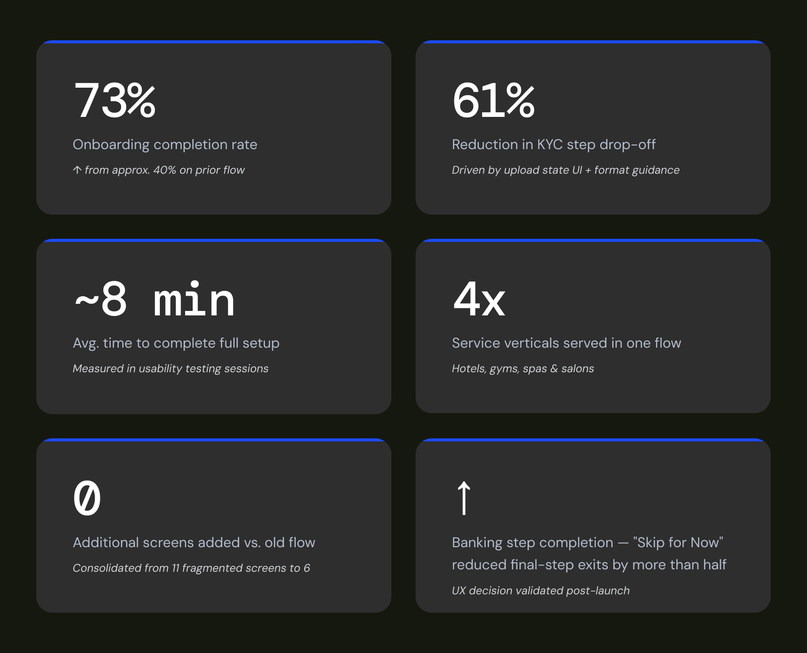
06 — Outcomes & Impact
The numbers that followed.
Post-launch tracking showed measurable uplift across the onboarding funnel, driven primarily by the structured 6-step stepper, improved KYC guidance, and the optional banking step.
07 — Learnings
What this taught me.
- Trust is a design element, not a brand decision
- Progress visibility is conversion infrastructure
- Optional paths reduce exit rates

Samuel Ajayi
Usability Testing Participant

The flow feels simplified. I could make decisions without feeling overwhelmed.
Other Projects
© 2026 — Product Designer — Lagos, Nigeria
design@tijesuniolajide.com
Jalode
Web
B2B
Saas/ Marketplace
Redesigning the merchant onboarding experience for a multi-sided SaaS platform serving hotels, gyms, spas, and salons across Nigeria.
01 — Context
What is Jalode?
Jalode is a multi-sided SaaS platform and marketplace designed to be the operating system for service businesses — hotels, gyms, spas, and salons. It combines merchant management tools (bookings, staff, CRM, POS, payments) with a customer-facing marketplace for discovery and booking. For Jalode to work, merchants must be onboarded successfully. A failed or abandoned onboarding means no revenue, no customers, and no value generated on either side of the
marketplace.
02 — Problem
Onboarding was a wall, not a door.
The merchant onboarding process was technically functional but poorly designed for the reality of Nigerian business owners — many of whom were registering a digital SaaS platform for the first time. The flow was long, opaque, and offered no sense of progress or trust.
03 — Research & Discovery
Mapping the merchant's journey
Before touching any screens, I mapped the full journey from a prospective merchant's first contact point through to their first live booking — identifying friction, anxiety, and moments of delight.
04 — Information Architecture
Wireframes & flow logic.
Low-fidelity wireframes mapped the structural logic of each step before any visual design began. The primary goal: make each step feel singular and completable.
05 — High Fidelity Screens
Design decisions, annotated.
Step 1 of 6 — Account Creation
Low friction entry. Build trust early.
The lefthand panel runs across all 6 steps — not just for brand presence, but to communicate Jalode's value proposition while the user fills in forms. It turns a dead column into a conversion asset.
- Persistent left panel highlights Bank-grade Security, Fast Settlement, and Real-time Analytics — addressing the 3 biggest merchant anxieties upfront
- Password strength indicator with inline copy ("Min 8 chars, a number, and a symbol") reduces form errors without a separate validation screen.
- Google OAuth reduces time-to-step-2 for users with Gmail accounts — the dominant email provider among Lagos business owners.
- Progress stepper at the top is always visible — sets expectation of 6 steps, preventing mid-flow abandonment from surprise.
Step 4 of 6 — KYC / Business Verification
The hardest step, made approachable.
This was the #1 drop-off point in the old flow. The redesign treats it as a compliance task, not a test — guiding users through what's needed and why, with clear upload states.
- Uploaded CAC doc shows filename + "Replace document" link gives users control and eliminates anxiety about uploading the wrong file.
- Upload zones use dashed borders and inline guidance standard affordance or document upload, reducing cognitive load.
- CAC/RC Number field placeholder shows format (RC / 1234567)— removing a common source of confusion for new registrations.
- Subtitle copy: "We're required to verify your business. This takes 1–2 business days." — sets expectations, prevents repeated check-ins.
Step 5 of 6 — Business Profile Setup
The moment of pride. Make it feel real.
Merchants setting up their public profile are crossing from compliance into identity. This step needed to feel exciting — like launching a storefront, not filling a form.
- Logo upload zone is prominent and centered — the first visual act of brand ownership for the merchant on Jalode.
- Branch/Location component with "Add another branch" expands the form inline — avoids a new page for multi-location businesses.
- Operating hours uses toggle + time range pattern — toggling a day to "Closed" hides the time range, reducing visual clutter.
- Primary Location badge is immediately visible — important for multi-branch merchants who need to understand which location is default.
Step 6 of 6 — Settlement Account
Trust architecture for money conversations.
Asking a business owner to enter their bank account details in a new platform is a high-stakes UX moment. Every element on this screen exists to reduce anxiety and communicate legitimacy.
- "Powered by Providus Bank — Licensed by the Central Bank of Nigeria" appears above the form inputs. CBN licensing is a potent trust signal for Nigerian SMEs.
- Two-option card pattern (existing account vs. open new) sets context before asking for numbers — user understands what they're linking.
- "Skip for Now" as a secondary CTA reduces pressure. Merchants who skip can still access the platform and complete banking later.
- Shield icon on the trust card reinforces security visually — supports users who scan rather than read the full label text.
06 — Outcomes & Impact
The numbers that followed.
Post-launch tracking showed measurable uplift across the onboarding funnel, driven primarily by the structured 6-step stepper, improved KYC guidance, and the optional banking step.
07 — Learnings
What this taught me.
- Trust is a design element, not a brand decision
- Progress visibility is conversion infrastructure
- Optional paths reduce exit rates
Samuel Ajayi
Usability Testing Participant
The flow feels simplified. I could make decisions without feeling overwhelmed.
Other Projects
Xspeeria
Jalode
HumanManager Mobile Application
MarketRunz
© 2026 — Product Designer — Lagos, Nigeria
design@tijesuniolajide.com