
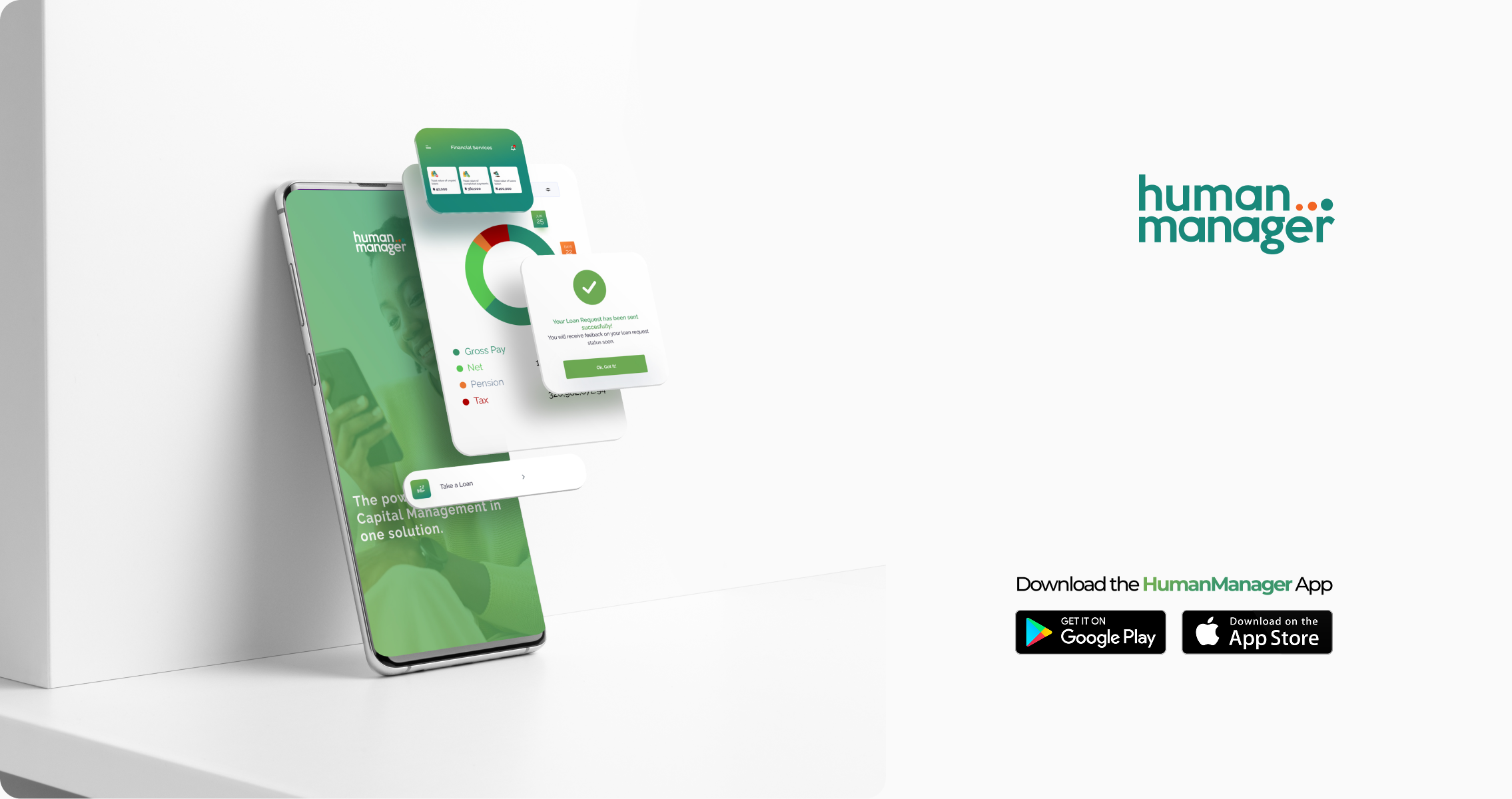
HumanManager Mobile Application
Mobile App
HR Tech
SAAS
30 years of HR. Now in your pocket. A legacy enterprise HRIS with nearly three decades of adoption needed to meet employees where they are, on mobile. Designing the HumanManager ESS app from the ground up.
01 — Context
The product that outgrew its container
HumanManager is Nigeria's leading Human Resource Information System (HRIS), a part of the SystemSpecs groups. For close to three decades, it has powered HR operations — payroll, leave management, staff records, expense management, performance management, Learning and development, loan approvals for organizations across Africa.
The entire experience lived on the web. As mobile-first work culture accelerated, employees were asking one question: why can't I do this from my phone?
02 — Problem
A powerful system locked behind a browser.
The HumanManager web platform was rich in functionality — but it was never designed for mobile screens.
Checking a payslip meant finding a desktop. Approving a leave request meant being at a desk. For enterprise clients trying to drive self-service adoption, every one of those moments was a drop-off and a call to HR that didn't need to happen.
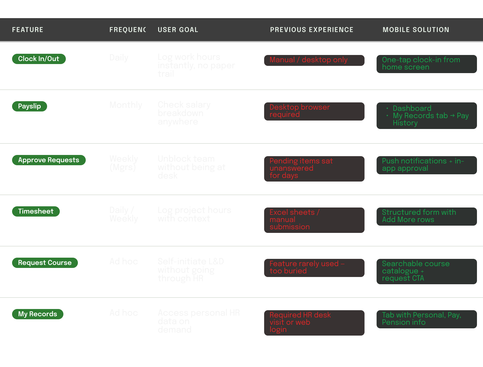
03 — Research & Discovery
What employees actually needed on mobile.
Rather than porting every web feature to mobile, the key design question was: which tasks do employees want to do quickly, on the go? The research phase mapped the frequency and urgency of each HR transaction to determine what belonged in the mobile app and what didn't.
04 — High Fidelity Screens
Design decisions, annotated.
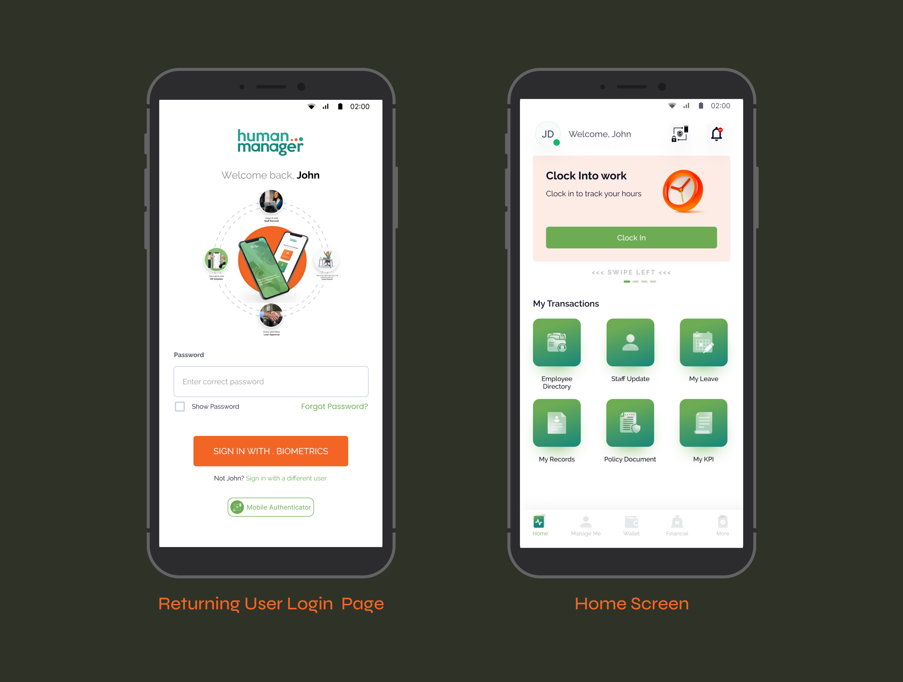
Sign In — Returning User
Authentication that respects repeat users.
A returning employee doesn't need to re-enter their credentials from scratch. The app remembers the user's identity and surfaces their name and profile on return, reducing login time to a single password entry or biometric tap.
- Personalized "Welcome back, John", the app recognizes returning users and skips the email step entirely.
- Biometric sign-in (fingerprint / Face ID) as the primary CTA, fastest path to access for daily users.
- "Not John? Sign in with a different user" — gracefully handles shared or multi- user devices common in enterprise settings.
Home — Dashboard
The hardest step, made approachable.
The home screen was designed around one insight: the first thing most
employees do when they start work is clock in. Everything else radiates
from that. The dashboard surfaces the clock-in card prominently, then
organizes secondary transactions in a clear grid below.
- Clock-in hero card dominates the top ,the highest-frequency daily action gets the highest-priority
- Swipeable card carousel allows surfacing other quick actions (leave status, pay-slip) without cluttering the main view.
- Notification badge on the bell icon gives managers instant visibility into pending approvals on every session.
- "My Transactions" grid uses icon-first cards — scannable at a glance, no heavy reading required.
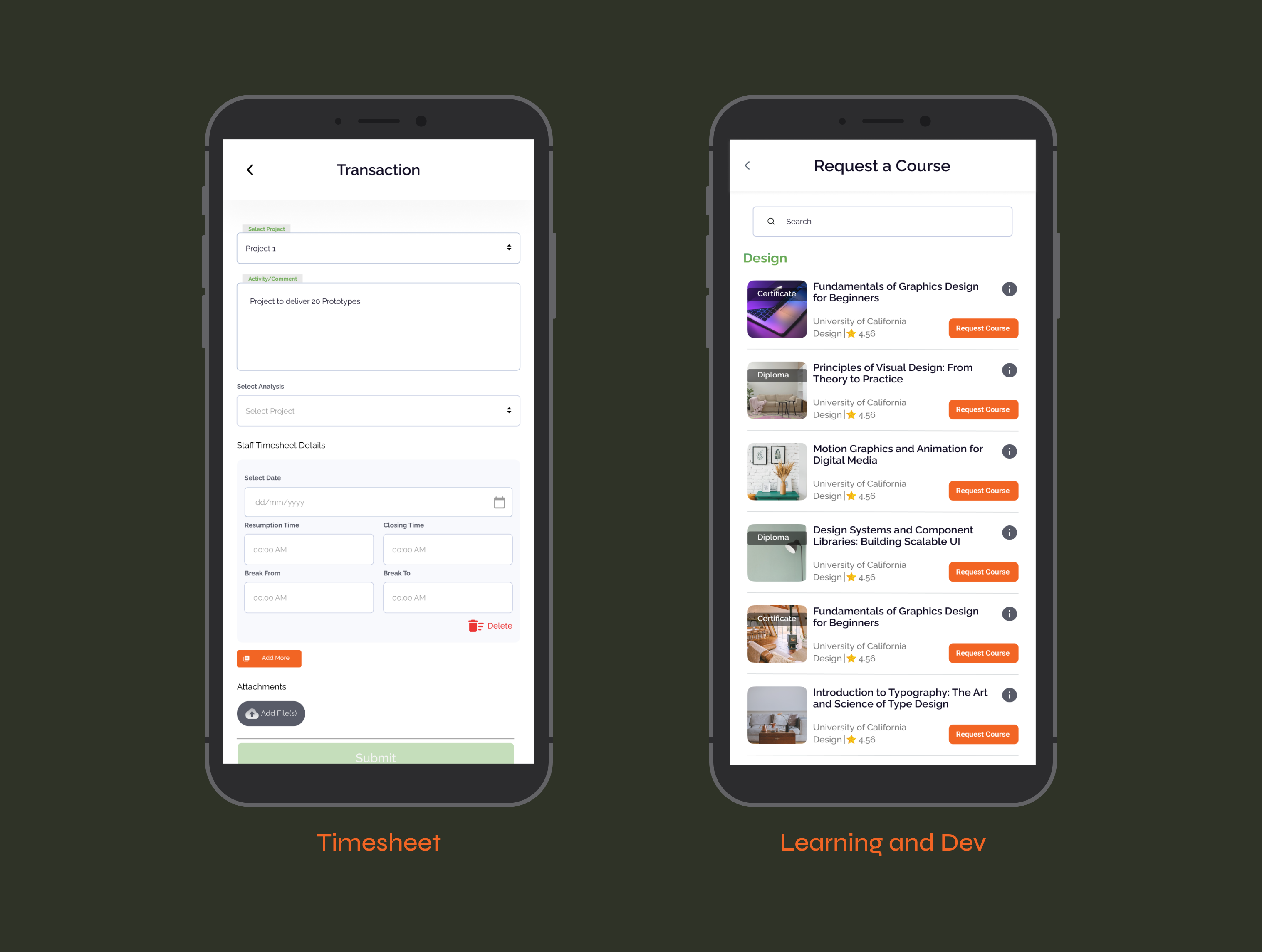
Timesheet — Transaction Entry
Complex data entry, simplified.
Timesheet submission requires structured data, project, activity, date,
time in, time out, breaks. The challenge was making this feel lightweight
on a small screen without sacrificing the detail that HR and payroll teams
depend on.
- Floating label inputs (Select Project, Activity/Comment) keep the interface clean while maintaining field context as users type.
- "Add More" CTA allows logging multiple timesheet entries in one submission, critical for employees who work across multiple projects in a day.
- Delete control per entry row prevents errors from cascading — users can remove a row without starting over.
Learning — Request a Course
Self-driven learning, finally accessible.
The L&D module was one of the least-used features on the web platform, not because employees didn't want to learn, but because requesting a course was buried under too many clicks. The mobile version makes it a first-class action.
- Search bar at the top, employees know what they want to learn; let them find it without scrolling through categories.
- Info icon per course opens details without leaving the list, browse mode stays intact.
- Course cards show provider, category, rating, and credential type (Certificate/ Diploma), all the signal needed to make a decision.
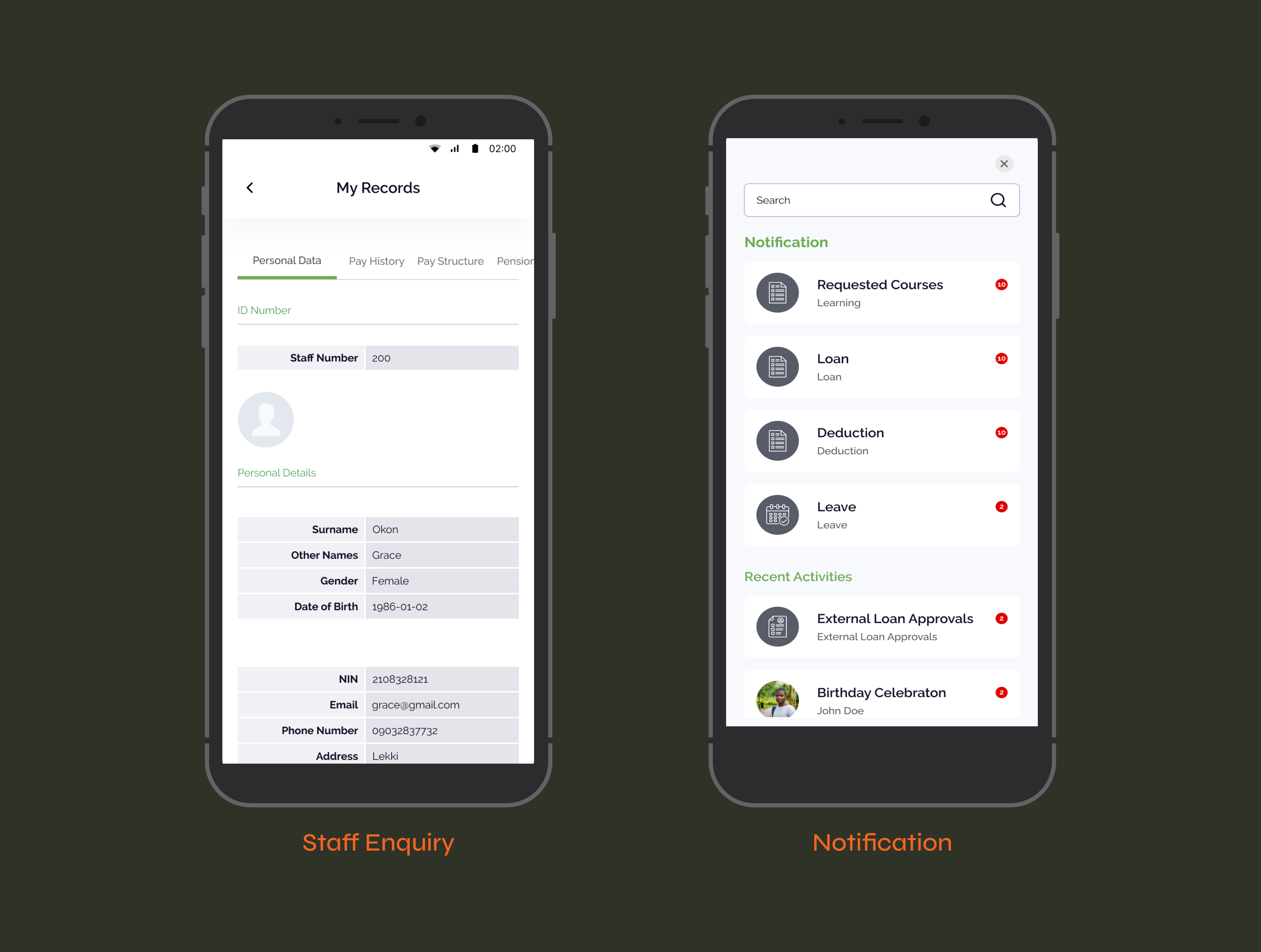
My Records — Staff Enquiry
Your HR file, always with you.
Employees frequently need access to personal HR data, staff number,
pay structure, pension details, but previously had to call HR or log into
the web platform from a desktop. My Records puts this data in their
pocket, structured and scannable.
- Horizontal tab navigation (Personal Data, Pay History, Pay Structure, Pension), keeps the information architecture flat and swipeable.
- Two-column table layout (Label | Value) mirrors familiar government and HR document formats, no learning curve.
- Section dividers (ID Number, Personal Details) use the brand green to create hierarchy without adding visual weight.
Notifications & Activity Feed
Nothing missed. Everything actionable.
For managers, unread notifications represent real work waiting, loan
approvals, leave requests, deductions to review. The notification center
groups by type and shows counts, making it easy to triage without
opening every item.
- Grouped by category (Requested Courses, Loan, Deduction, Leave), managers can prioritize by type, not by chronology.
- Badge count per category gives instant volume awareness. A manager with 10 pending loans knows before they tap.
- Recent Activities section below separates informational updates from action-required items, reduces cognitive load.
05 — Outcomes & Impact
What happened after launch.
The app launched into an existing enterprise client base. Rollouts were org-wide, so adoption reflected real working conditions from day one: employees across Nigeria clocking in, managers approving requests, HR teams processing records. The web platform had three decades of trust behind it. The mobile app had to earn the same trust in a fraction of the time. The ratings say it did.
06 — Reflections
What this taught me.
- Mobile is not a miniaturized web
The biggest temptation was to port the web features one-for-one. The right call was to ask: what does a person actually need to do in 30 seconds from their phone? That question shaped every screen. - Frequency determines priority
Clock-in happens every day. Payslip check happens monthly. Designing the home screen meant understanding this rhythm — and making sure the most frequent action required the fewest taps. - Trust unlocks adoption in enterprise
Employees were sharing personal data — bank details, attendance, health records —with a new mobile app. Every security affordance (biometrics, encrypted transit) had to be visible, not just real.

Kycomehome (Review from App store)
Manager

I have used this solution on the web for 14 years. Having it as a mobile App is the best decision of the owners. It's easy to use and I can view my details, updates and review and also approve my subbordinate requests including KPI and performance! Nice one.
Other Projects
© 2026 — Product Designer — Lagos, Nigeria
design@tijesuniolajide.com
HumanManager Mobile Application
Mobile App
HR Tech
SAAS
30 years of HR. Now in your pocket. A legacy enterprise HRIS with nearly three decades of adoption needed to meet employees where they are, on mobile. Designing the HumanManager ESS app from the ground up.
01 — Context
The product that outgrew its container
HumanManager is Nigeria's leading Human Resource Information System (HRIS), a part of the SystemSpecs groups. For close to three decades, it has powered HR operations — payroll, leave management, staff records, expense management, performance management, Learning and development, loan approvals for organizations across Africa.
The entire experience lived on the web. As mobile-first work culture accelerated, employees were asking one question: why can't I do this from my phone?
02 — Problem
A powerful system locked behind a browser.
The HumanManager web platform was rich in functionality — but it was never designed for mobile screens.
Checking a payslip meant finding a desktop. Approving a leave request meant being at a desk. For enterprise clients trying to drive self-service adoption, every one of those moments was a drop-off and a call to HR that didn't need to happen.
03 — Research & Discovery
What employees actually needed on mobile.
Rather than porting every web feature to mobile, the key design question was: which tasks do employees want to do quickly, on the go? The research phase mapped the frequency and urgency of each HR transaction to determine what belonged in the mobile app and what didn't.
04 — High Fidelity Screens
Design decisions, annotated.
Sign In — Returning User
Authentication that respects repeat users.
A returning employee doesn't need to re-enter their credentials from scratch. The app remembers the user's identity and surfaces their name and profile on return, reducing login time to a single password entry or biometric tap.
- Personalized "Welcome back, John", the app recognizes returning users and skips the email step entirely.
- Biometric sign-in (fingerprint / Face ID) as the primary CTA, fastest path to access for daily users.
- "Not John? Sign in with a different user" — gracefully handles shared or multi- user devices common in enterprise settings.
Home — Dashboard
The hardest step, made approachable.
The home screen was designed around one insight: the first thing most
employees do when they start work is clock in. Everything else radiates
from that. The dashboard surfaces the clock-in card prominently, then
organizes secondary transactions in a clear grid below.
- Clock-in hero card dominates the top ,the highest-frequency daily action gets the highest-priority
- Swipeable card carousel allows surfacing other quick actions (leave status, pay-slip) without cluttering the main view.
- Notification badge on the bell icon gives managers instant visibility into pending approvals on every session.
- "My Transactions" grid uses icon-first cards — scannable at a glance, no heavy reading required.
Timesheet — Transaction Entry
Complex data entry, simplified.
Timesheet submission requires structured data, project, activity, date,
time in, time out, breaks. The challenge was making this feel lightweight
on a small screen without sacrificing the detail that HR and payroll teams
depend on.
- Floating label inputs (Select Project, Activity/Comment) keep the interface clean while maintaining field context as users type.
- "Add More" CTA allows logging multiple timesheet entries in one submission, critical for employees who work across multiple projects in a day.
- Delete control per entry row prevents errors from cascading — users can remove a row without starting over.
Learning — Request a Course
Self-driven learning, finally accessible.
The L&D module was one of the least-used features on the web platform, not because employees didn't want to learn, but because requesting a course was buried under too many clicks. The mobile version makes it a first-class action.
- Search bar at the top, employees know what they want to learn; let them find it without scrolling through categories.
- Info icon per course opens details without leaving the list, browse mode stays intact.
- Course cards show provider, category, rating, and credential type (Certificate/ Diploma), all the signal needed to make a decision.
My Records — Staff Enquiry
Your HR file, always with you.
Employees frequently need access to personal HR data, staff number,
pay structure, pension details, but previously had to call HR or log into
the web platform from a desktop. My Records puts this data in their
pocket, structured and scannable.
- Horizontal tab navigation (Personal Data, Pay History, Pay Structure, Pension), keeps the information architecture flat and swipeable.
- Two-column table layout (Label | Value) mirrors familiar government and HR document formats, no learning curve.
- Section dividers (ID Number, Personal Details) use the brand green to create hierarchy without adding visual weight.
Notifications & Activity Feed
Nothing missed. Everything actionable.
For managers, unread notifications represent real work waiting, loan
approvals, leave requests, deductions to review. The notification center
groups by type and shows counts, making it easy to triage without
opening every item.
- Grouped by category (Requested Courses, Loan, Deduction, Leave), managers can prioritize by type, not by chronology.
- Badge count per category gives instant volume awareness. A manager with 10 pending loans knows before they tap.
- Recent Activities section below separates informational updates from action-required items, reduces cognitive load.
05 — Outcomes & Impact
What happened after launch.
The app launched into an existing enterprise client base. Rollouts were org-wide, so adoption reflected real working conditions from day one: employees across Nigeria clocking in, managers approving requests, HR teams processing records. The web platform had three decades of trust behind it. The mobile app had to earn the same trust in a fraction of the time. The ratings say it did.
06 — Reflections
What this taught me.
- Mobile is not a miniaturized web
The biggest temptation was to port the web features one-for-one. The right call was to ask: what does a person actually need to do in 30 seconds from their phone? That question shaped every screen. - Frequency determines priority
Clock-in happens every day. Payslip check happens monthly. Designing the home screen meant understanding this rhythm — and making sure the most frequent action required the fewest taps. - Trust unlocks adoption in enterprise
Employees were sharing personal data — bank details, attendance, health records —with a new mobile app. Every security affordance (biometrics, encrypted transit) had to be visible, not just real.
Kycomehome (Review from App store)
Manager
I have used this solution on the web for 14 years. Having it as a mobile App is the best decision of the owners. It's easy to use and I can view my details, updates and review and also approve my subbordinate requests including KPI and performance! Nice one.
Other Projects
Xspeeria
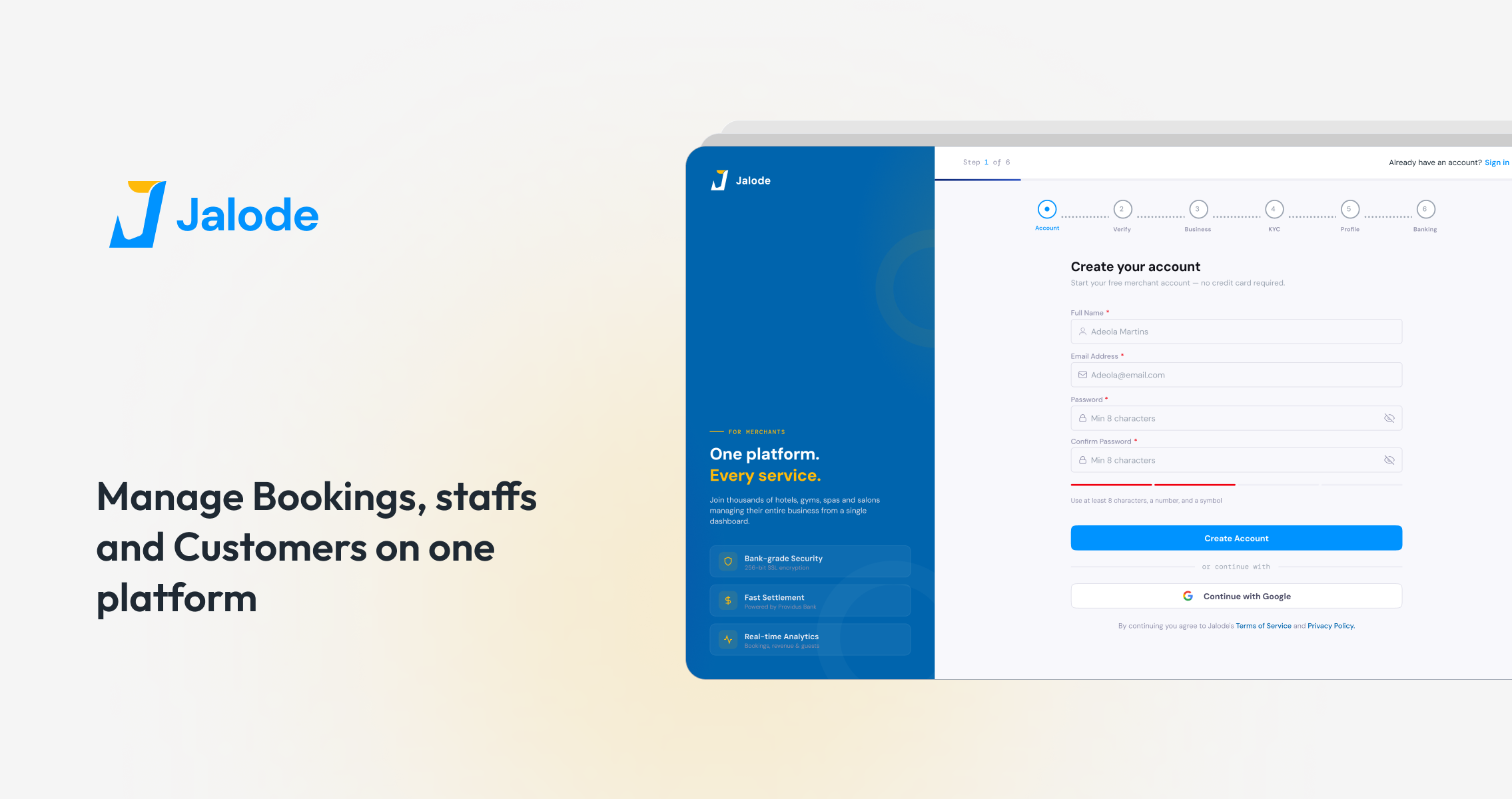
Jalode
HumanManager Mobile Application
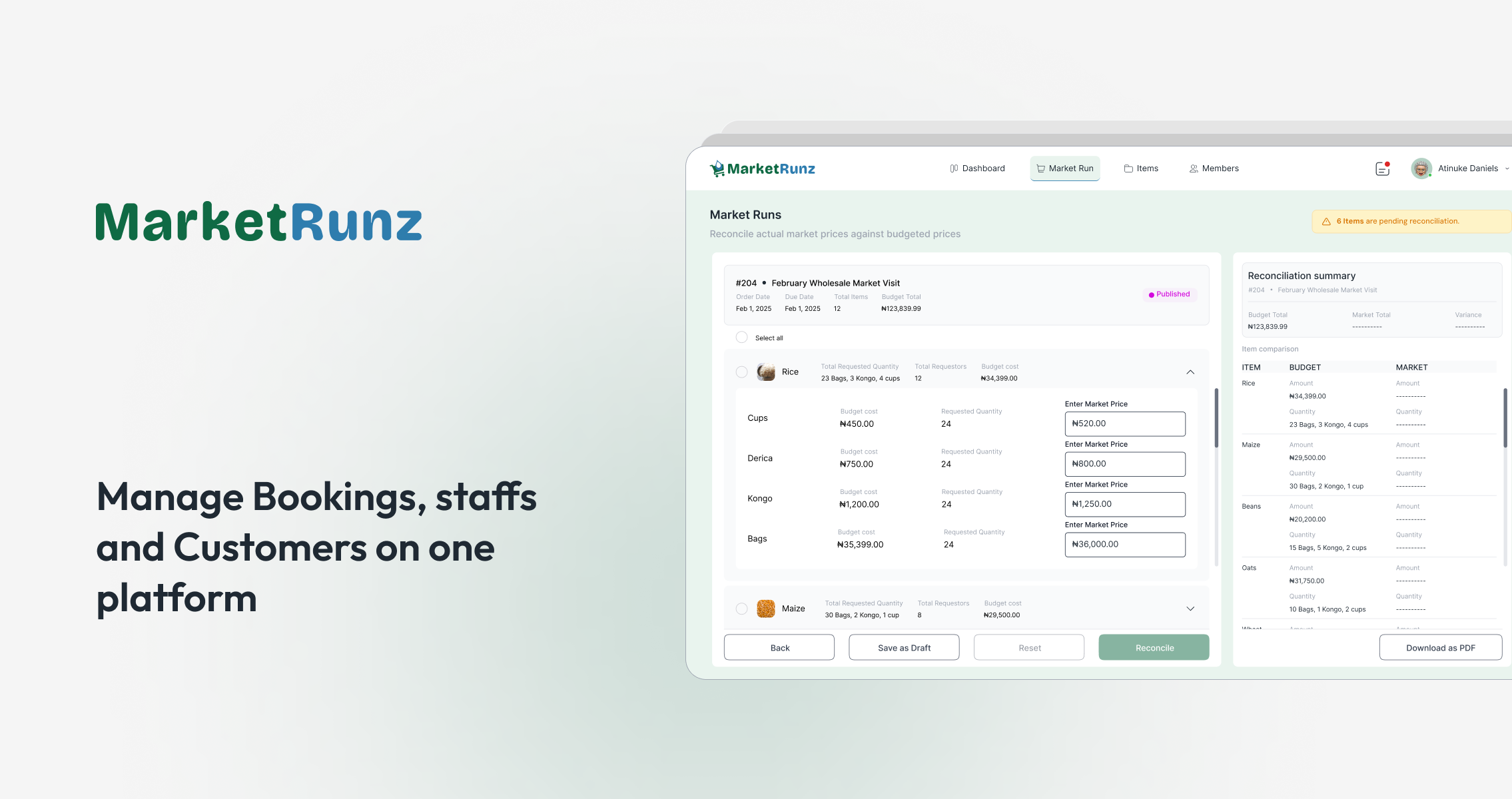
MarketRunz
© 2026 — Product Designer — Lagos, Nigeria
design@tijesuniolajide.com